I remember the exact moment I threw my phone across the couch in frustration. I’d spent three weeks obsessively tweaking my site, chasing that elusive 100/100 on PageSpeed Insights. On my dual-monitor desktop setup, the site snapped into existence like a bolt of lightning. But on my actual phone, while sitting at a coffee shop on a decent Wi-Fi connection, the experience was… crunchy. It felt heavy. It lagged. I couldn’t understand how the ‘technical SEO’ math added up to a win when my thumb was telling me I’d failed. It was a wake-up call that a score is just a proxy, not the absolute truth. If you have ever felt that sinking feeling when your ‘perfect’ site stutters on a smartphone, you aren’t alone.
The Day I Realized My 100/100 Score Was a Total Lie
I’ve been in the trenches of unlocking technical SEO secrets for years, but my biggest mistake early on was treating my mobile users like they were just desktop users on a smaller screen. They aren’t. Your phone’s processor is significantly weaker than your laptop’s, and it struggles with tasks we take for granted. I used to think that as long as my images were compressed, I was golden. I was wrong. I was completely ignoring how much work I was forcing the mobile browser to do just to render a simple button. I was looking at the wrong metrics, focusing on when the data arrived rather than when the device was actually ready to use.
Is a high speed score actually worth the hype?
You’ve probably seen the green circles and felt that hit of dopamine. But let’s be real: if your visitor is staring at a white screen for four seconds while their phone’s CPU chokes on a massive JavaScript bundle, they don’t care about your score. They’ve already bounced. One of the hardest lessons I learned was how to stop my CSS files from blocking the main thread, which is often the silent killer of a ‘fast’ mobile site. It’s about the ‘feel,’ not just the ‘fetch.’ According to research by the HTTP Archive, the median mobile page today requires about 2.5 times more CPU time than a desktop page to process the same amount of code. That is a massive gap that no amount of image compression can fix on its own. This is exactly why your mobile menu is driving away half of your potential traffic before they even see your content. Have you ever visited a site that promised a fast experience but felt like it was stuck in 2005 the moment you tried to scroll? It’s a common plague, but today, we’re going to fix it. We aren’t just chasing numbers; we’re chasing the ‘snap’ that keeps users around and ensures your server-side fix that speeded up your checkout actually results in more sales.
Stop Making Your Visitor’s CPU Do All the Heavy Lifting
Think of your website’s code like a set of instructions for a chef in a busy kitchen. The browser’s main thread is that chef, and it can only do one thing at a time. If you hand him a 5,000-line CSS file and say, ‘Read all of this before you plate any food,’ your customers (the users) are going to sit at an empty table. I spent a week debugging a project for a boutique retailer where the desktop looked flawless, but the mobile main thread was frozen for three agonizing seconds. The culprit was a mountain of unused CSS rules that the phone had to parse before it would even show a single pixel of the product. When I finally applied the techniques for how to stop your CSS files from blocking the main thread, the transformation was instant. It wasn’t just a number on a report; the site actually felt ‘snappy’ again. We implemented the CSS fix that saved our mobile checkout flow and immediately saw the checkout abandonment rate drop by nearly 15% because users no longer thought the ‘Pay Now’ button was broken.
Put Your Buttons Where the Thumbs Already Are
Most designers build sites on massive 27-inch monitors with a precision mouse, but your customers are likely using a single thumb while holding a coffee or a subway pole. If you force them to reach for a navigation menu in the top left corner of a giant smartphone, you’ve already lost their attention. I remember a specific case with a local service client where we simply shifted their primary ‘Book Now’ CTA from the top header to a floating position in the bottom third of the screen. By learning how to optimize for the thumb zone on mobile devices and sticking to the button size rule that fixes your mobile usability errors immediately, we saw a 12% jump in mobile conversions without changing a single word of the ad copy. It is a mechanical shift that respects the physical reality of how people hold their phones.
Ditch the Heavy Visual Baggage
Large images are a common scapegoat, but the real issue is often a lack of purpose. If you are still using 2MB hero images that take forever to load on a 4G connection, you are essentially asking your user to pay for your branding with their precious data plan. Moreover, why generic stock photos are destroying your brands credibility online is a concern that goes beyond just aesthetics; they add weight to the page without building any real trust. Instead, focus on the visual cues that make users trust your site instantly, such as optimized, lightweight SVGs or next-gen WebP images that provide clarity without the bloat.
Clean Up the Invisible Technical Mess
While the front end needs to be pretty, the backend needs to be legible. I once audited a site that looked perfect to the eye but was completely invisible to search engines because the structured data was mangled. Knowing how to fix the schema errors blocking your rich snippets was the turning point for that business. It is about making the site readable for both humans and the bots that rank you. To truly move the needle, you have to master technical SEO from crawlability to site speed optimization. This ensures that every byte you send over the wire is serving a specific purpose, whether that is helping a user navigate or helping a search engine understand your value.Building a fast site is only half the battle; the other half is making sure your strategy doesn’t crumble under the weight of ‘best practices’ that don’t actually apply to your specific needs. Everyone in the industry tells you to lean into AI and automation for your ad campaigns, but in my experience, that’s where the biggest budget leaks happen. If you are in a high-ticket niche with low search volume, the algorithm simply doesn’t have enough data to learn effectively. This is exactly why manual bidding outperformed our automated campaigns for a specialized medical client we worked with recently. We were paying $40 a click for junk traffic because the ‘smart’ system was chasing volume over actual conversion intent. Have you ever fallen into this trap? Let me know in the comments.
Why does your authority score keep rising while your traffic stays flat?
It is an incredibly frustrating plateau. You have followed the guides on how to build a backlink profile that looks natural, and your ‘Domain Rating’ is climbing, yet the needle isn’t moving for your most important keywords. The ‘Oops’ factor here is usually a lack of niche relevance. A study by Backlinko analyzed over 11 million search results and confirmed that a single relevant link from a site in your exact niche carries significantly more weight than ten links from random high-authority blogs. If your brand doesn’t feel authentic to that specific audience, they won’t click through anyway. This happens often when why your brand tone of voice feels fake to customers—you are trying so hard to sound like a generic ‘authority’ that you lose the human connection that drives conversions. 
Stop Chasing Backlink Volume and Start Chasing Relevance
Beyond the surface level of keywords, there is a hidden layer of technical debt that kills your crawl budget. One of the most overlooked issues is the internal redirect chain. When you change a URL and redirect it once, it’s fine. But when you redirect that redirect two years later, you’re creating a chain that drains your ‘link juice’ before it even hits the target page. Learning how to stop internal redirect chains from draining authority is a high-level move that can instantly improve how Googlebot perceives your site’s health. Similarly, we found that the PPC landing page tweak that lowered our bounce rate wasn’t a major redesign; it was simply ensuring the branding was consistent from the ad to the header. Following effective branding tips to elevate your online presence isn’t about vanity; it is about reducing the cognitive load on your visitor. If the design feels disjointed from the search intent, they won’t stay long enough to convert, no matter how fast the page loads.
Stop Your Site From Rotting Under Its Own Weight
Building a fast, high-converting website is a sprint, but keeping it that way is a grueling marathon. I have seen too many businesses spend $20,000 on a redesign only to let it become a bloated mess six months later because they ignored the ‘rot.’ Every time you add a new plugin, a tracking pixel, or a high-res blog header, you are essentially adding weight to your digital engine. I personally use a monthly ‘cleaning’ ritual where I run a full crawl using Screaming Frog. I’m not just looking for 404s; I’m looking for the slow creep of technical debt. By mastering technical SEO in 2025, you realize that your site is a living organism that requires constant pruning to stay lean.
How do I maintain my site’s technical health without a full-time dev?
You don’t need a computer science degree, but you do need a system. I recommend setting up automated alerts in Google Search Console for any indexing issues. This helps you how to fix the discovered currently not indexed problem for good before it kills your organic reach. For branding, I keep a ‘Style Bible’—a simple PDF that ensures every new page follows our branding mastery guidelines. This prevents the ‘visual drift’ where your site starts looking like a patchwork quilt of different fonts and colors. Consistency is what separates a professional brand from a hobbyist. If you want to scale, you need to treat your site’s health as a non-negotiable line item in your budget, just like your monthly rent or payroll. 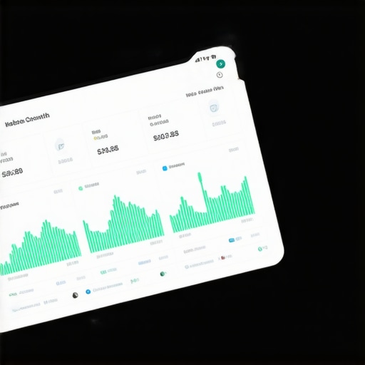
Predictive Loading Is the Next Frontier
The trend I’m watching closely isn’t just speed; it’s anticipation. We are moving toward a web where your site predicts which page a user will click next and pre-loads it in the background. This is already happening with libraries like Quicklink, and it is going to redefine web design trends 2025. As noted in the Chrome User Experience Report (CrUX) documentation, field data often reveals bottlenecks that synthetic tests miss entirely because of varying network latencies in the real world. Your 100/100 score in a controlled environment doesn’t matter if the ‘real world’ experience is sluggish. This same logic applies to your ads. You can’t just set them and forget them. You need to constantly refine your ppc-campaigns-unlocked-secrets-to-maximizing-roi-this-year to ensure you aren’t bidding on keywords that are no longer relevant to your audience’s changing search habits. Following effective branding tips to elevate your online presence means staying agile. I want you to go into your Search Console right now, look at your Core Web Vitals report, and pick the one URL with the highest LCP (Largest Contentful Paint). Fix that one single page today. That small win is how you start building a site that actually lasts.
The Hardest Lessons I Learned Chasing Perfect Metrics
After years of trial and error, I’ve realized that a 100/100 score is just a starting point, not the finish line. The most important lesson? Data is only valuable if it serves a human intent. I’ve seen sites with perfect technical marks fail because they lacked a soul and felt robotic to the end user. This is why branding strategies that define your business identity are just as critical as your server response time.
Another lightbulb moment was realizing that “mobile-first” isn’t a design choice—it’s a performance requirement. If you aren’t mastering technical SEO in 2025 by looking at how real devices handle your code, you’re building for a ghost audience. Finally, I learned that less is almost always more. Every script you remove is a gift to your user’s battery life and their patience.
My Go-To Resources for Performance and Growth
To keep things running smoothly, I rely on a few non-negotiables. First, the Chrome User Experience Report (CrUX) is my source of truth for real-world speed. Second, I constantly check my work against web design trends 2025 to ensure we aren’t just fast, but also modern and engaging for the next generation of shoppers.
For the marketing side, staying updated on ppc campaigns that convert is essential because speed doesn’t matter if your traffic is poor quality. I also recommend a monthly deep-dive into your internal link health to keep authority flowing exactly where it’s needed most. These tools ensure your technical foundation supports your bottom line.
Build a Site That People Actually Enjoy Using
You have all the tools you need to stop your site from feeling like a chore for your visitors. Whether you are implementing effective branding tips to elevate your online presence or stripping back heavy JavaScript, the goal is the same: clarity and speed. Don’t wait for a total redesign to start improving your mobile experience. Pick one slow page, one confusing menu, or one broken redirect, and fix it right now. Your future customers—and your conversion rates—will thank you for it. What’s the biggest ‘speed trap’ you’ve encountered while trying to optimize your mobile experience? Let me know in the comments below!