Imagine it is Sunday afternoon. The pressure is mounting at Augusta National. You are away from your television, stuck in a grocery line or at a family event, and you desperately need to know if the leader just carded a bogey on the 12th. You pull out your phone, open your favorite app to check the PGA tour leaderboard, and instead of a clear view of the standings, you are met with a cluttered mess of overlapping text, truncated names, and a layout that requires more horizontal scrolling than a 1990s spreadsheet. The frustration is immediate. In that moment, the interface hasn’t just failed; it has actively hindered your experience as a fan.
My name is Jordan Yiu. As a UX Designer at Sports Endeavors and an alumnus of The University of Georgia, I live at the intersection of sports analytics and mobile interaction design. I’ve spent my career obsessing over how data translates from a massive stadium jumbotron to a five-inch piece of glass in your pocket. The reality is that while sports news today is more accessible than ever, the actual usability of live data on mobile is often an afterthought. We are inundated with top news stories and flashy graphics, but when it comes to the core utility of sports apps – consuming dense, live data – the industry is currently facing a usability crisis.
In this deep dive, I want to explore the fundamental mobile layout flaws that make live sports data unreadable and provide actionable solutions for designers who want to build better experiences for the modern fan.
Section 1: The “Wide Data” Problem on Narrow Screens
The most significant hurdle in sports UX is the inherent nature of the data itself. Sports data is “wide.” Whether it’s a baseball box score, a football stat sheet, or a golf leaderboard, the information is traditionally organized in a multi-column format designed for desktop monitors or printed newspapers. However, mobile screens are narrow. When you try to squeeze a PGA tour leaderboard – which might include Rank, Player, Total Score, Thru, Round 1, Round 2, and FedEx Cup points – into a 375px width, something has to give.
According to research from UXdesign.cc, basic leaderboard structures simply do not scale well to mobile because they are inherently wide-format data sets. Many designers attempt to solve this by shrinking the font or using horizontal scrolling. Both are recipes for disaster. Shrinking the font leads to legibility issues, while horizontal scrolling hides critical context. If I scroll to the right to see a player’s back-nine score, I often lose sight of the player’s name on the left. This “context loss” is a primary reason why responsive design isn’t enough for a truly great mobile experience.
The solution isn’t just to make things smaller; it’s to prioritize. Designers must determine which three columns are the “must-haves” and move the rest into an expandable “drill-down” view. For example, the primary view should only show Rank, Player, and Total Score. Anything else should be one tap away. By acknowledging that a mobile screen cannot be a 1:1 replica of a desktop table, we can begin to design for the constraints of the device rather than fighting against them.
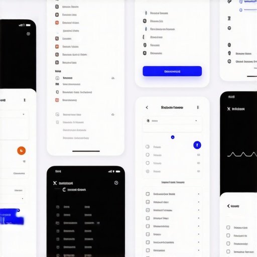
Section 2: Card-Based Layouts vs. Information Density
In the quest to make apps look “modern,” many designers have pivoted toward card-based layouts. These look beautiful on a portfolio site like Dribbble, but for a “second-screen” user, they are often incredibly inefficient. A card-based layout for a list of games might only allow two or three matchups to be visible on the screen at once. This creates massive vertical “scroll fatigue.”
On forums like r/sportsanalytics, power users often complain that modern sports apps prioritize aesthetics over information density. When you are tracking multiple games at once, you want a bird’s-eye view, not a gallery of large images. Furthermore, these large cards often leave too much white space, which gets filled with distracting, non-sports content. If a user is trying to find a score and they are forced to scroll past a promo for 1923 season 3 or a weather alert about 10 ft of snow, the UI has failed to prioritize the user’s intent. The Interaction Design Moves That Keep Mobile Users on the Page are those that respect the user’s time and cognitive load.
To fix this, designers should consider a “hybrid” approach. Use cards for featured content or “Game of the Day,” but revert to high-density lists for leaderboards and scoreboards. The goal is to maximize the amount of relevant data visible without overwhelming the eye. This balance is what separates a professional sports tool from a generic news aggregator.
Section 3: The Fantasy Factor – Complexity at Scale
The rise of fantasy sports has added another layer of complexity to mobile UX. A user participating in a fantasy baseball mock draft or tracking NFL player news isn’t just looking for a score; they are looking for deep-dive metrics, injury updates, and historical trends. This is where “information scent” becomes critical. If a user has to tap through four different menus to find out why their star quarterback is listed as “Questionable,” they will likely give up and go to a competitor.
One of the biggest flaws in fantasy-related UI is poor typography. When you are dealing with rows of numbers – ERA, WHIP, Yards Per Carry – the font choice matters immensely. Monospaced numbers are essential for scannability, yet many apps use proportional fonts that make columns look jagged and hard to read. This is a classic case of why your mobile fonts are actually hurting your UX. Furthermore, fantasy apps often clutter the interface with irrelevant celebrity gossip or general interest stories. A user looking for a stat line doesn’t care about who died this week famous or a documentary asking what did aaron hernandez do; they need the data that affects their lineup immediately.
Designers must implement better filtering and sorting mechanisms that are accessible via the thumb. If I’m in the middle of a draft, I need to filter by “Available Players” and “Position” instantly. If these filters are buried behind a “hamburger menu” or at the very top of the screen, the friction becomes unbearable. Web Design Trends 2025: Innovative Ideas for Modern Sites suggest that context-aware filtering is the future of data-heavy applications.
Section 4: Latency and Technical Debt
We often talk about UX as a visual discipline, but in the world of live sports, performance is UX. Take the PGA Tour app as a case study. Recent App Store and Reddit feedback highlights a recurring theme: the app “breaks constantly” and is often “several holes behind actual play.” If a layout is beautiful but the data is ten minutes old, the layout is irrelevant.
Technical debt often manifests as a sluggish UI. When an app tries to load too many external scripts – trackers, ad networks, or even top news stories that have nothing to do with the game – the main thread of the application gets bogged down. This results in “jank” during scrolling and delays in data refreshes. Sports fans are among the most demanding users because their content is time-sensitive. They might tolerate a delay in yahoo.com political reporting, but a 30-second delay in a live score can ruin the “live” experience.
To solve this, designers and developers must work in tandem to prioritize the “Critical Rendering Path” of the data. The score and the clock should be the first things to load and the most frequently updated. Everything else – player bios, related videos, and social media feeds – should be lazy-loaded. This ensures that even on a poor 5G connection, the user gets the one piece of information they came for: the current state of the game.
Section 5: The “Thumb-Zone” and Navigation Errors
Finally, we must address the physical ergonomics of mobile use. Most sports apps are used with one hand – often while the user is doing something else. Yet, many of the most critical interactive elements, such as the “Refresh” button or the “Search” bar, are placed at the very top of the screen in the “hard-to-reach” zone.
This is a direct violation of the thumb-zone rule for better mobile conversions and happier users. In a sports context, if I have to reposition my grip every time I want to switch between the “Live” and “Upcoming” tabs, the app feels clunky. The one layout tweak that keeps people scrolling longer is moving navigation and primary filters to the bottom of the screen, within easy reach of the thumb.
Furthermore, we need to talk about “fat-finger” errors. In a high-density data environment, buttons and touch targets need to be large enough to hit without accidentally clicking the wrong row. If I’m trying to tap on a player’s name to see their stats but I accidentally hit a small “X” that closes the leaderboard, I am going to be frustrated. Proper spacing and hit-target sizing are not just design guidelines; they are essential for a functional sports interface.
Designing for the “Live” Experience
The future of sports UX lies in “Data-First” design. We have to stop treating mobile apps like smaller versions of websites and start treating them like specialized tools. A fan checking a score in the middle of a meeting has different needs than a fan sitting on their couch with an iPad. We must design for the context of use.
When we fail to prioritize the data, we lose the user to distractions. They might start by looking for a score but end up reading latest US news or US politics news because the sports data was too hard to find. At Growth Digital Co, we specialize in auditing these experiences to ensure your users stay engaged with your content. If your mobile layout is making your data unreadable, it’s time for a professional UX review. Let’s build a sports experience that is as exciting as the game itself.