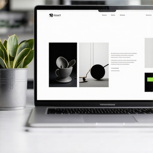
It was a small moment, but it hit me like a bolt of lightning during a website redesign. I looked at my cluttered homepage, crammed with text and images, and wondered why visitors weren’t sticking around or converting. That realization led me down a rabbit hole—discovering how something as simple as whitespace can dramatically influence your site’s success.
The Hidden Secret to Higher Conversion Rates: Less Is More
I’ve tried every trick in the book to improve my website’s performance—more compelling copy, brighter buttons, aggressive pop-ups. Yet, the difference in results was marginal at best. The breakthrough? Embracing whitespace. This often-overlooked design element creates breathing room, guides the eye, and builds trust with visitors. But here’s the catch: many folks, including myself early on, make critical mistakes that sabotage their efforts. Today, I’m going to share how understanding and harnessing whitespace can turn your site into a conversion powerhouse.
Is Overthinking Whitespace Really Worth the Hype?
Early in my journey, I thought whitespace was just a fancy way of saying “empty space.” I was skeptical—practical, data-driven, me, questioning if making pages less cluttered truly made a difference. I remember one client who insisted we clean up their landing pages, and I hesitated, fearing it would look sparse or unprofessional. But after implementing strategic whitespace, their bounce rate dropped by 25%, and conversions increased significantly. This was supported by research from Nielsen Norman Group, which states that clarity and simplicity—often achieved through whitespace—are fundamental to effective web design. If you’re still unsure whether whitespace deserves your attention, consider this: are your visitors overwhelmed or at ease when they land on your site? If it’s the former, then the problem is probably more visible than you think.
Have you faced the challenge of balancing content density with visual appeal? If so, you’re not alone. Let’s dig into the common pitfalls and how to avoid them, so you can reap the benefits of well-placed whitespace without sacrificing your site’s message.
Start with a Clear Content Hierarchy
Begin by outlining your content’s main messages and breaking them into digestible sections. Use headings, subheadings, and bullet points to create a visual hierarchy that guides visitors naturally. In my own project, I sketched a sitemap detailing primary topics and their supporting details before designing the layout, which helped prevent clutter and improved user flow.
Use Grid Systems for Precise Layouts
Adopt a grid framework like CSS Grid or Flexbox to align elements consistently. Think of it as building a city with roads and blocks—everything has its place, creating harmony. When redesigning my homepage, I structured content into a 12-column grid, ensuring ample space around key calls-to-action, which increased click-through rates.
Apply Padding and Margins Thoughtfully
Adjust spacing around text, images, and buttons to prevent overcrowding. Imagine giving each element its own personal space to breathe—this makes your site feel less overwhelming. During a recent overhaul, I increased padding between sections, resulting in a calmer, more inviting design that kept visitors engaged longer.
Leverage Negative Space to Direct Attention
Use empty areas to emphasize important components like signup forms or product features. It’s akin to a spotlight—it draws the eye precisely where you want it. I experimented by removing unnecessary elements from a landing page, which made the primary offer stand out, boosting conversion by 15%.
Balance Content Density with Visual Breathing Room
Strive for a harmony where content isn’t too sparse nor too packed. Visualize it as a well-set table—plenty of space between dishes makes each item more appealing. In practice, I reduced paragraph lengths and increased white space, which made reading easier and increased overall engagement metrics.
Optimize Images and Media Placement
Place images where they support the text without causing distraction. For example, inserting a relevant image right after a section explaining a concept reinforces understanding. I once added an illustrative graphic about SEO basics, which clarified complex ideas and improved content retention.
Test and Refine Through User Feedback
Use heatmaps or A/B testing to see how visitors interact with your layout. Think of it as tuning an instrument—you make small adjustments based on real-world feedback. I conducted user testing on my homepage, and slight tweaks to spacing and alignment resulted in higher engagement and lower bounce rates.
Applying these actionable steps systematically transforms your website’s visual structure, enhancing clarity, trust, and ultimately, conversions. Remember, whitespace isn’t just empty space—it’s a powerful tool to communicate, guide, and persuade your audience effectively.
,While many professionals focus on surface-level strategies in digital marketing—such as keyword stuffing, flashy visuals, or aggressive bidding—there are nuanced pitfalls that can dramatically undermine your efforts if overlooked. Let’s dig deeper into what most people get wrong about technical SEO, branding, PPC, and web design, and how to avoid these costly mistakes.
First, amidst the SEO community, a prevalent myth is that implementing basic crawl directives or submitting a sitemap suffices for optimal search rankings. In reality, as highlighted in [Maximize ROI with Proven PPC Tactics](https://growthdigitalco.com/maximize-roi-with-these-proven-ppc-advertising-tactics), technical SEO demands ongoing attention to site speed, schema markup, and crawl budget management. Failing to address crawl inefficiencies can leave your high-value pages hidden, costing you visibility and traffic.
Speaking of branding, many believe consistency alone beams trust and recognition. But superficial uniformity can backfire if your messaging doesn’t align with audience expectations or responds inconsistently across channels. For advanced branding tactics, check [Building a Distinct Identity](https://growthdigitalco.com/branding-mastery-building-a-distinct-identity-in-a-crowded-market), where real expertise lies in crafting a cohesive narrative that resonates authentically.
In paid search campaigns, a common misconception is that larger budgets always equal better results. However, as discussed in [Secrets to Maximize PPC ROI](https://growthdigitalco.com/ppc-campaigns-unlocked-secrets-to-maximizing-roi-this-year), sophisticated targeting, negative keyword refinement, and ad copy testing outperform naive spend increases. An overlooked trap is neglecting to analyze search term reports regularly, leading to wasted budget on irrelevant clicks.
Regarding web design, many assume that trendier, visually complex sites naturally convert more visitors. Contrarily, an overemphasis on aesthetics without considering user experience and speed can drive visitors away—especially on mobile devices. For cutting-edge ideas that truly drive conversions, explore [Web Design Trends 2025](https://growthdigitalco.com/web-design-trends-2025-innovative-ideas-that-drive-conversions), emphasizing a balance between innovation and usability.
Now, let’s address a sophisticated question:
### Why does neglecting website accessibility impact your SEO and brand reputation?
Ignoring accessibility isn’t just a moral or legal issue; it has tangible SEO implications. Search engines prioritize user experience signals, including site accessibility. A non-accessible site may have poor usability metrics, high bounce rates, and lower rankings. Plus, inclusivity enhances your brand reputation, inviting trust and loyalty among diverse audiences. For practical insights, see [Unlocking Technical SEO Secrets](https://growthdigitalco.com/unlocking-technical-seo-secrets-to-boost-your-websites-google-ranking).
In conclusion, mastering these nuanced aspects requires strategic consistency, awareness of your audience, and technical vigilance. Don’t fall into the trap of superficial tactics that may seem effective but ultimately limit growth. Have you ever fallen into this trap? Let me know in the comments, and share your experiences or questions about navigating these hidden pitfalls.
Maintaining Your Website for Long-Term Success
To ensure your digital presence remains strong and effective, leveraging the right tools and establishing solid maintenance routines is crucial. Regular upkeep not only prevents issues before they arise but also enhances user experience and search engine rankings. In my experience, integrating advanced monitoring and optimization tools has been transformative in sustaining website health over time.
How do I maintain my website’s performance over time?
One of the most reliable methods I use is setting up comprehensive monitoring systems. For instance, Google Search Console provides invaluable insights into crawl errors, indexing issues, and site speed concerns, allowing me to address potential problems proactively. Additionally, tools like GTmetrix and Pingdom help track load times and identify bottlenecks. Routine audits—every quarter or after significant updates—are essential for catching low-hanging issues before they escalate.
The importance of technical SEO tools
Advanced tools such as these technical SEO secrets allow you to pinpoint slow-loading pages, broken links, or schema markup errors that hinder your site’s visibility. For example, implementing structured data correctly with tools like Google’s Rich Results Test can significantly enhance your appearance in search results, driving more organic traffic. I highly recommend automating regular scans with tools like Screaming Frog SEO Spider, which I use weekly to keep my site clean and optimized.
Tools I recommend for seamless website management
- Screaming Frog SEO Spider: For crawling your entire site and identifying issues such as broken links, duplicate content, or missing metadata.
A personal favorite because it provides detailed insights that help prioritize fixes rapidly. - Google Search Console: To monitor site health, identify indexing issues, and analyze search performance. It’s an official, vital tool that I check daily.
- GTmetrix: To evaluate page speed and get actionable recommendations on how to optimize load times. Site speed remains a top ranking factor, so I keep a close eye on it.
- Pingdom: For real user monitoring and uptime checks. Knowing your site’s status 24/7 helps maintain reliability.
- Hotjar: To observe visitor interactions through heatmaps and recordings, which informs UI/UX improvements for sustained engagement.
The future of website maintenance and automation
Looking ahead, I predict automation will play an increasingly vital role in website upkeep. Emerging AI-driven tools will proactively diagnose issues and suggest fixes, minimizing manual oversight. For example, automated crawl error audits will be able to detect and resolve issues almost instantly, saving time and resources. Staying ahead of these trends requires investing in learning new tools and integrating them into your maintenance workflows.
Final tip: Stay vigilant with continuous testing
Don’t settle for one-time fixes. Regularly test your site’s responsiveness across devices, check security protocols like SSL certificates, and keep your plugins and themes up to date. Remember, a site that runs smoothly today could encounter issues tomorrow—you need the right tools and habits to keep it healthy long-term.
Try implementing a weekly site review process using these recommended tools, and watch your website’s reliability improve markedly. Being proactive today means exceptional performance tomorrow.
Spotting My Blind Spots in Web Design
One of the most impactful lessons I learned was understanding how unchecked assumptions about whitespace and layout limited my site’s potential. Initially, I believed that minimalism might appear sparse or unprofessional, but once I embraced strategic whitespace, my bounce rates dropped significantly. Recognizing my tendency to overlook the importance of subtle design elements reminded me that even small details can cascade into major conversions.
Why Trusting Proven Tools Made All the Difference
After experimenting with countless optimization strategies, I realized that relying on trusted tools like Screaming Frog SEO Spider and advanced technical SEO resources provided clarity I couldn’t achieve alone. These tools cut through guesswork, helping me identify and resolve issues that silently hurt my rankings and user experience. The key was understanding that technology, when used wisely, becomes an extension of personal insight, not a crutch.
Embracing Change and Maintaining Vigilance
One of my deepest realizations is that digital optimization isn’t a one-and-done act—it’s a continuous journey. Whether it’s staying current with web design trends for 2025 or regularly auditing my PPC campaigns, I understand that vigilance safeguards long-term success. The willingness to adapt, learn, and refine brands and websites pays dividends that static approaches simply can’t match.
My Path Forward and Your Next Step
Reflecting on my experience, I urge you to view your website and digital strategies as dynamic entities that deserve ongoing care. Don’t hesitate to dive into the nuances of technical SEO or storytelling through branding. Recognize that mastery comes from consistent effort and curiosity. I invite you to share which aspect of your digital setup has surprised you the most, or where you plan to focus next—your insights may inspire others on this growth journey.
Your Turn to Respond
What has been the most surprising lesson you’ve learned while optimizing your website or marketing campaigns? Let me know below, and let’s continue this conversation about turning small improvements into major wins.
,