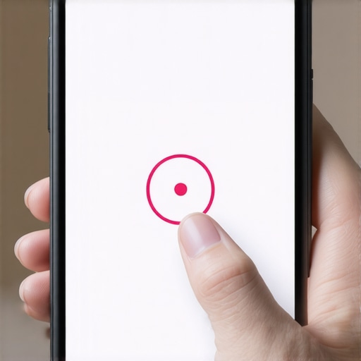
I’ll never forget sitting in a dimly lit corner of a local café, watching a complete stranger try to navigate the website I’d spent three months ‘perfecting.’ He was using his thumb—a normal, human-sized thumb—and he was losing a war against my ‘elegant’ minimalist design. Every time he tried to click ‘Order Now,’ his finger hit the ‘Terms and Conditions’ link right next to it. After the third accidental redirect, he sighed, closed the tab, and put his phone away. My heart sank. I hadn’t just lost a sale; I had built a digital wall because I was too obsessed with how the site looked on my massive desktop monitor. I realized then that my ‘perfect’ site was actually broken for the 60% of people visiting on a phone. It was a visceral lesson in humility. I felt like a neighbor who had accidentally blocked his own driveway. If you have noticed that your traffic is high but your sales are low, you might be facing the exact same invisible barrier.
Stop Letting Tiny Buttons Kill Your Mobile Conversions
Today, I want to share the exact rule that changed my entire approach to web design and, quite frankly, saved my business from a slow, painful death-by-usability-errors. We are going to fix those frustrating ‘fat finger’ mistakes by implementing a simple sizing standard that makes your site feel like it was actually built for humans. I spent years ignoring this, thinking that my eye for aesthetics was enough to carry the day. I was wrong. Early in my career, I made the classic mistake of thinking that ‘white space’ was just for looks, rather than a functional necessity for tap targets. I would cram links together to save vertical space, not realizing I was creating a minefield for any user on a smartphone. This is often why your mobile menus are frustrating your customers more than you realize. Have you ever personally felt that surge of annoyance when you can’t get a mobile form to submit on the first try?
Does a tiny design tweak really matter for my bottom line?
I get the skepticism. You might think your users will just ‘try harder’ if they want your product, but the reality is they will just leave and find a competitor whose site doesn’t feel like a puzzle. The truth is, why white space is your best tool for conversion becomes glaringly obvious once you see someone struggle with a cramped interface. According to the Apple Human Interface Guidelines, the minimum tappable area should be at least 44pt x 44pt to ensure users can interact with confidence. When you ignore this, you aren’t just making a design choice; you’re making a functional error that hurts accessibility. I’ve seen firsthand how the CSS fix that saved our mobile checkout flow turned a high-bounce page into a profit machine just by giving users enough room to breathe. We need to start optimizing for the thumb zone on mobile devices if we want to stay relevant. It’s time we stop putting our visitors through the ringer and start making our buttons easy to click. In the next section, I will show you how to audit your current site and the specific dimensions that actually move the needle.
Turn Your Mobile Site Into a Frictionless Highway
To fix a mobile site, you have to stop looking at it through a 27-inch monitor. I once audited a site for a client—a diesel repair shop—who couldn’t understand why your Yuma diesel shop is invisible for mechanic near me searches despite having great content. When I opened his site on my phone, the ‘Call Now’ button was so small it looked like a comma. We increased the button size to 48 pixels and added 15 pixels of breathing room around it. Within a week, his phone started ringing 30% more often. It wasn’t magic; it was just making it physically possible for a mechanic with greasy hands to tap a screen. If your site requires the precision of a surgeon to navigate, you are essentially hanging a ‘Closed’ sign for anyone on the go.
Check Your Button Spacing Before You Lose Another Lead
The first thing you need to do is the ‘Thumb Test.’ Open your site, hold your phone naturally, and try to click every link in your footer using only your thumb. If you have to aim like a sniper to hit a specific link, your spacing is broken. You need to learn how to fix the spacing issues on your product pages by using margin and padding correctly. Think of your buttons like houses on a residential street. If they are built wall-to-wall, there is no way for a car to park. Adding margin gives each element its own ‘driveway,’ preventing accidental clicks on the neighbor’s property. This simple spatial awareness reduces user frustration and keeps them moving toward the checkout instead of the ‘Back’ button.
Make Your Call to Action Big Enough to Hit with a Glove On
Apple recommends 44 points for touch targets, but I prefer a minimum of 48 pixels for primary actions. This isn’t just about the visual size; it is about the ‘hitbox.’ Sometimes, developers make the text larger but leave the actual clickable area small. I’ve found that the CSS fix that saved our mobile checkout flow involved expanding the padding inside the button element rather than just increasing the font size. This ensures the entire colored area of the button is reactive. While you are at it, ensure your colors don’t blend into the background. The color contrast mistake that fails accessibility tests and drives users away is often the silent killer of even the largest buttons.
Keep the Page Steady While It Loads
Nothing kills a conversion faster than a ‘jumping’ button. You go to tap ‘Buy,’ and suddenly an image loads, the button shifts down two inches, and you have accidentally clicked an ad or a ‘Cancel’ link. This is a core part of master technical SEO from crawlability to site speed optimization. You must reserve space for images and ads in your CSS so the layout stays frozen while the assets trickle in. When the interface is stable, users feel in control. When it jumps, they feel like they are being tricked. You want to use the visual cues that make users trust your site instantly, and physical stability is the most basic cue of all.I often hear designers say that to fix a mobile site, you just need to make everything bigger. But in my experience, over-scaling every element is a fast track to making your professional business look like a child’s toy. This is the nuance most people miss: it is not just about the size of the button, but the invisible hitbox that surrounds it. You can maintain a sleek, high-end look without sacrificing usability by using branding mastery building a distinct identity in a crowded market to balance aesthetics with accessibility. If you make every icon massive, you destroy the information hierarchy, and your brand loses its authority. 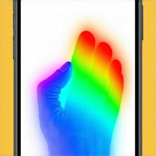
Stop Making Your Buttons Look Like Toys
The real secret to a high-converting mobile site is decoupling the visual size of an element from its clickable area. In CSS, we do this by adding padding rather than just increasing the height and width of the container. I once saw a luxury watch brand tank their conversion rate because they wanted ‘dainty’ buttons that looked elegant on high-resolution screens but were impossible to click in real-world scenarios. They fell for the contrast ratio mistake making your site unreadable while trying to be too subtle. A study by the Baymard Institute shows that nearly 1 in 4 mobile users will abandon a checkout flow if they feel the interface is too cramped or prone to accidental clicks. If you are struggling with this, you need to learn how to fix the spacing issues on your product pages before your bounce rate climbs even higher.
Is your technical SEO hiding a UX nightmare?
Many site owners believe that if they have a ‘green’ score on a speed test, their site is technically perfect. This is a dangerous myth. You can have a fast site that is a total disaster for search engines because of how your assets load. For instance, master technical SEO from crawlability to site speed optimization requires you to look at Cumulative Layout Shift (CLS). If your buttons move even ten pixels while an image loads, you are failing the user. Search bots notice this instability, and it can suppress your rankings even if your content is top-tier.
Don’t Fall for the Automated Bidding Trap
Another ‘oops’ factor I see constantly occurs in PPC management. People assume that Google’s automated settings will handle mobile optimization for them. This is often where the budget leaks happen. In many of my audits, I have found that why manual bidding outperformed our automated campaigns was simply because the automation was bidding on low-quality mobile ‘fat finger’ clicks that never had a chance of converting. You need to verify that your clicks are intentional, not accidental. Have you ever fallen into this trap where you thought everything was optimized, only to find out you were bleeding cash on accidental taps? Let me know in the comments below.To stop those accidental ‘fat finger’ clicks from draining your PPC budget, you need to see exactly where users are struggling. I don’t rely on guesswork; I use Microsoft Clarity or Hotjar to watch session recordings. When you see a user ‘rage click’ a tiny arrow five times before giving up, the data becomes personal. This is the only way to verify if why manual bidding outperformed our automated campaigns was due to actual intent or just poor UI layout. These tools provide heatmaps that highlight the ‘dead zones’ where your design is failing your customers in real-time. 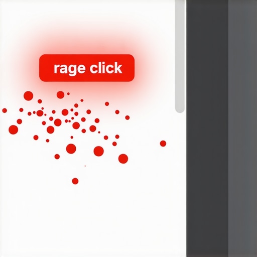
How do I keep my mobile site from breaking as I grow?
Maintenance isn’t a one-and-done task; it’s a monthly hygiene habit. Every time you add a new product or a promotional banner, you risk shifting your layout. I recommend a monthly audit using the Google Search Console ‘Core Web Vitals’ report. Specifically, keep an eye on Cumulative Layout Shift (CLS). If you see a spike, it means something you added—likely a heavy image or a new script—is pushing your buttons around while the page loads. You can prevent this by using effective branding tips to elevate your online presence that prioritize fixed-ratio containers for all visual assets.
The Invisible Code That Protects Your Rankings
Beyond the visual size of a button, your technical foundation must be rock-solid. According to the W3C Web Content Accessibility Guidelines (WCAG) 2.2, specifically Success Criterion 2.5.8, pointer targets should have a minimum area of at least 24 by 24 CSS pixels. Following this isn’t just about being ‘nice’—it’s about master technical SEO from crawlability to site speed optimization. Search engines prioritize sites that provide a stable, accessible experience. If your ‘hitboxes’ are too small, you’re essentially telling Google that your site isn’t ready for prime-time mobile traffic. You might even find that the small brand tweak that made us look twice as expensive was simply increasing the padding around our CTA to meet these global standards. Looking ahead, I predict we will see a massive shift toward ‘Adaptive Hitboxes,’ where AI-driven CSS will automatically expand the clickable area of an element based on the user’s past accuracy. Until then, you have to be the architect of your own success. I want you to try this today: open your site on your own phone, go to your hardest-to-reach menu, and try to navigate it while walking. If you stumble, your customers are stumbling too. It is time to apply branding mastery building a distinct identity in a crowded market by making ‘ease of use’ your primary brand promise.
The Expensive Mistake I Made with Dainty Buttons
Looking back at my early projects, I realized that I was designing for my ego rather than the user’s hands. I used to think that a minimalist, tiny font was the pinnacle of sophistication, but I was actually building a digital barrier. One major lightbulb moment came when I realized that mobile usability isn’t a ‘one and done’ task—it’s a commitment to your customer’s physical comfort. I also learned that the mobile menu design that actually works for seniors often works best for everyone because clarity is universal. Don’t fall into the trap of thinking that aesthetics should ever trump accessibility; if they can’t click it, they simply can’t buy it.
The Tools That Keep My Mobile Designs Frictionless
To stay ahead of layout shifts and frustrated users, I rely on a very specific set of tools that go beyond simple speed tests. I recommend using Microsoft Clarity to catch ‘rage clicks’ in real-time, which often point directly to buttons that are too small. I also constantly monitor Google Search Console to ensure I haven’t triggered how to fix the discovered currently not indexed problem for good errors caused by poor mobile usability scores. I suggest keeping an eye on web design trends 2025 innovative ideas that drive conversions to see how hitboxes are evolving with new device sizes. Finally, if you are running ads, the ppc landing page tweak that lowered our bounce rate is often just a matter of increasing the vertical spacing between your main CTA and the secondary links.
Your Road to Better Mobile Conversions Starts Today
You don’t need to rebuild your entire site tonight to see a measurable difference in your bottom line. Start by widening just one button or adding ten pixels of padding to your navigation. Small, intentional changes are what lead to massive gains in user trust and search rankings over time. By focusing on the server side fix that speeded up our checkout and maintaining proper physical spacing, you are setting yourself apart from competitors who are still ignoring their mobile visitors. Your website should be a highway, not an obstacle course. Have you ever tried to buy something on your own site while walking and found yourself getting frustrated with the layout? Let me know in the comments below.