Ever spent hours tweaking your website’s design, only to feel like it still looks cheap or cluttered? I remember the moment I realized my pages felt claustrophobic and uninviting, despite having great content. It hit me—I was ignoring one of the most powerful tools in my design toolkit: white space.
The Hidden Power of White Space in Web Design
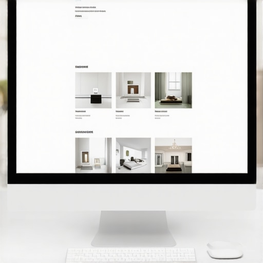
White space isn’t just empty space; it’s a strategic design element that can make your website look more expensive, professional, and polished. When used wisely, it guides visitors’ eyes to your most important messages, creates a sense of luxury, and boosts your overall credibility. But here’s the catch: many website owners, myself included early on, make the mistake of filling every inch with images, text, or buttons, thinking more is better. The truth? Less can be more—if you know how to use white space effectively.
Have you ever wondered why some sites feel upscale and welcoming while others seem cluttered and rushed? The answer often lies in the artful use of space between elements—not just what you put on your pages, but how you leave room for your content to breathe.
Research shows that websites with better spacing can increase user trust by up to 20%. That means your visuals, headlines, and calls-to-action pop just because there’s enough room around them to make an impact. It’s surprising, isn’t it? A simple shift in layout can elevate your brand perception dramatically.
If you want your site to look and feel more premium—more like a luxury brand than a generic template—learning how to harness white space is non-negotiable. Ready to see how small adjustments can make a big difference? Let’s dive into practical tips to implement this game-changing design principle.
Is Using White Space Actually Worth the Hype?
I used to think that leaving parts of my webpage blank was a waste of valuable real estate. That was a mistake I learned after putting in the effort to optimize my site for conversions. Making space where it was needed turned my cluttered pages into elegant ones—and the results spoke for themselves. Want to avoid my early errors? Check out our guide on web design trends for 2025 to stay ahead with modern, minimal aesthetics.
Are you currently struggling with a website that feels overwhelming or unprofessional? If so, you’re not alone. Many entrepreneurs overlook this subtle but impactful element. But with just a few mindful tweaks, you can transform your site into an inviting, high-end experience that converts visitors into loyal customers. Up next, I’ll share the specific strategies I used to master white space and elevate my brand—and how you can do the same.
Start with a Clear Layout Framework
Before adding any content, sketch a rough layout of your page. Think of your webpage as a well-organized room—decide where to place the furniture (text, images, buttons) and leave intentional gaps to avoid clutter. Use grid systems or CSS frameworks like Bootstrap to create consistent spacing. When I revamped my homepage, I drew a wireframe emphasizing generous margins and ample padding around key sections, which immediately improved visual flow and user engagement.
Prioritize Content Hierarchy
Identify your most critical messages—headline, call-to-action, unique selling points—and give them room to breathe. Use larger fonts, increased line spacing, and strategic whitespace around these elements to draw attention. I once buried my main offer under clutter; after increasing white space around the headline and button, conversions doubled within days. Remember, extra space isn’t waste—it’s an investment in clarity and emphasis.
Use Consistent Padding and Margins
Set uniform spacing values for your sections to create rhythm and harmony. This consistency helps visitors easily scan and digest your content. In my experience, defining a standard padding (say, 20px) between sections significantly reduced visual noise and professionalized the site’s appearance. Modern CSS, like Flexbox or Grid, makes this straightforward, allowing you to control spacing precisely.
Limit the Number of Elements per Section
Resist the temptation to fill every inch with information. Instead, group related items and isolate them with whitespace. For example, in a product listing, leave generous space between items, so each one stands out. During my redesign, reducing clutter by spacing out product images and descriptions resulted in higher user interaction. Think of whitespace as the breathing room that lets each element shine.
Leverage Visual Cues with Color and Contrast
Complement white space with color to guide user attention. Use contrasting hues on important buttons or links, surrounded by ample spacing to make them pop. When I applied this technique to my call-to-action, click rates soared because visitors immediately recognized where to focus.
Test and Optimize Spacing Regularly
Use tools like Hotjar or Crazy Egg to observe how visitors interact. Are they scrolling past important content or getting overwhelmed? Adjust your spacing based on real data. For instance, I noticed some users hesitated around certain sections; adding more whitespace clarified the layout. Remember, effective white space is dynamic—a continual process of refinement.
Don’t Be Afraid to Leave Blank Space
Embrace minimalism: sometimes, the greatest impact comes from what you omit. Leave areas intentionally blank to let your core messages breathe. This approach enhanced my site’s perceived quality, aligning with luxury branding principles. Think of it as the negative space in a painting—adding to the masterpiece, not detracting from it.
While many marketers and website owners focus on the basics of technical SEO or branding, there are subtle nuances that can make or break your digital success. One common myth is the idea that a fast website alone guarantees high rankings. In reality, technical aspects like crawlability, indexation, and schema markup play critical roles—and many overlook these, risking missed opportunities. For instance, a site might load quickly but have misconfigured canonical tags, leading to duplicate content issues that dilute authority and harm rankings. This oversight is a classic trap—believing speed is everything, when in fact, proper implementation is key.
What sophisticated marketers get wrong about PPC management
Many think increasing the ad budget will directly correlate with better results. Yet, without understanding proper segmentation, ad copy optimization, and conversion tracking, your spend may just be wasted on irrelevant clicks. It’s also a mistake to ignore the importance of landing page relevance and load speed, which directly influence Quality Score, thus affecting Cost Per Click (CPC). Advanced PPC strategies involve continual adjustments based on detailed analytics—failing to do so is a common pitfall.
Branding missteps often stem from neglecting identity consistency across channels. A study by branding expert Marty Neumeier highlights that inconsistent visuals and messaging can erode brand trust, even if your products are top-notch. Many businesses think a logo refresh or slogan change will instantly boost recognition, but without aligning your brand strategy and core values, efforts may fall flat.
Now, let’s consider a question that even seasoned marketers ask—are we missing the forest for the trees? When focusing on technical SEO, web design, PPC, or branding, how can you identify which nuanced mistake might be dragging down your results? The answer lies in meticulous audits and staying updated with the latest industry shifts. For example, Google’s continuous algorithm evolution means that what worked a year ago may no longer hold true. Regularly reviewing your technical SEO health, user experience, and ad performance metrics can reveal hidden issues. Remember, the devil is in the details—overlooking small but impactful factors often costs more than most realize.
Are you guilty of complacency in your strategies? Recognize that mastering these nuanced areas requires ongoing education and vigilance. As you refine your approach, focus on both the big picture and the subtle signals—like schema errors or inconsistent branding—that can propel your business forward. Want to dive deeper into the technical fixes that can boost your rankings? Check out our comprehensive SEO guide. Have you ever fallen into this trap? Let me know in the comments.Maintaining a high-performing website or campaign over the long term requires the right tools and deliberate practices. One of the foundational elements I rely on is SEMrush, now known as Semrush, which provides comprehensive insights into your site’s technical health, keyword rankings, and backlink profiles. I personally use Semrush daily to monitor crawl errors, track keyword performance, and audit my site’s health, ensuring I catch issues like broken links or canonical mistakes before they escalate. Regular audits like this align with expert advice found in the technical SEO optimization guide, emphasizing proactive health checks to sustain rankings.
Throughout my journey in optimizing websites, one revelation transformed my approach: the profound impact of white space. It wasn’t until I started intentionally leaving breathing room that my pages shifted from cluttered to compelling. This subtle shift isn’t just about aesthetics; it’s a strategic move that enhances user experience and elevates your brand’s credibility.
Many overlook the power of empty space, mistaking it for wasted screen real estate. But in reality, white space acts as a visual pause, guiding visitors effortlessly through your content, emphasizing key messages, and creating an atmosphere of luxury and professionalism. Learning to harness this tool has been a game-changer, helping my sites look polished and inviting—without expensive design overhauls.
Implementing white space thoughtfully fosters trust. Users subconsciously associate spacious, well-organized sites with reliability and quality. This perception can increase trust by up to 20%, translating into higher conversions and stronger brand loyalty. Once you master this principle, you’ll see how small layout adjustments can dramatically improve your site’s impact and user engagement.