
I remember sitting in my home office at 3 AM, staring at my first major client’s website with a sense of dread. I had chosen this piercing, electric lime green for the call-to-action buttons. I thought it was bold. I thought it was ‘modern.’ In reality, it looked like a radioactive warning sign. When we launched, the conversion rate didn’t just dip—it fell off a cliff. People weren’t clicking; they were recoiling. It was a painful, expensive lesson in how effective branding tips to elevate your online presence often start with what you shouldn’t do. If your website feels ‘off’ but you can’t pin down why, your palette might be the silent killer. Today, I’m going to show you how to audit your brand colors so you stop scaring people away before they even read your first sentence. Have you ever landed on a site and felt an immediate urge to leave because the colors felt… itchy? Trust me, you aren’t alone.
Stop Repelling Leads with Your Visual Choices
Most of us pick colors because we personally like them. I liked that lime green. But your customer doesn’t care what you like; they care how your site makes them feel. When you are developing branding strategies that define your business identity, you have to realize that color is a primal, subconscious signal. Research from the University of Winnipeg found that up to 90% of snap judgments made about products can be based on color alone. That is a terrifying statistic if you are using shades that inadvertently trigger anxiety or distrust in your specific niche. I once made the mistake of using a clinical, cold grey for a brand that was supposed to feel ‘warm and community-focused.’ It felt like a morgue rather than a meeting place. We have to do better than ‘just picking something pretty.’ You need to understand how to choose a color palette that fits your industry to ensure your visual cues match the service you provide.
Are these color theories just marketing fluff?
It is easy to be skeptical. You are a business owner, not an art critic. You might think that as long as your service is top-notch, the color of your header shouldn’t matter. I used to think the exact same thing until I realized that the color contrast mistake that fails accessibility tests and drives users away was making my content physically unreadable for a huge chunk of my audience. It isn’t about being artistic; it is about being functional and trustworthy. If you are a financial advisor using neon pink, or a security firm using soft, nursery pastels, you are sending mixed signals that scream ‘unreliable’ to the lizard brain of your prospect. We are going to break down how to align your colors with the expectations of your market so you can finally see the ROI your hard work deserves.
Strip Your Palette Down to the Essentials
The first thing we need to do is stop adding and start subtracting. Most messy brand identities aren’t failing because they lack color; they are failing because they have too many conflicting ones. Think of your website like a high-end suit. If you wear a neon tie, a checkered shirt, and striped pants, nobody hears what you’re saying—they just see the noise. To fix this, you have to look at what is already working in your space.
Look at the Neighbors Before You Paint Your House
Before you commit to a new scheme, you have to perform a landscape audit. I remember working with a local plumber who wanted to use deep purple because it was his daughter’s favorite color. We had to sit down and look at the search results together. Every top-ranking competitor used blues, reds, or greens—colors that signal ‘water,’ ‘urgency,’ or ‘safety.’ By choosing purple, he wasn’t being ‘unique’; he was being unrecognizable as a plumber. You have to learn how to choose a color palette that fits your industry or you will spend your entire marketing budget just trying to convince people you’re in the right business. Start by taking screenshots of the top five competitors in your niche. What is the dominant ‘vibe’? If everyone is using muted earth tones and you show up in safety orange, you better have a very good reason for it.
Stop Making Your Audience Squint
Accessibility isn’t just a legal checkbox; it is a conversion tool. I once spent three weeks redesigning a checkout page for a client, only to realize that our ‘elegant’ light grey text on a white background was completely unreadable for anyone over the age of 40. We were basically telling half our audience to go shop elsewhere. This is why the color contrast mistake that fails accessibility tests and drives users away is the silent killer of many small business sites. Use a contrast checker tool to ensure your text pops. If your eyes feel tired after reading two paragraphs on your own site, your bounce rate is going to stay high regardless of how good your SEO is. 
The Single Adjustment That Changes Everything
Sometimes, you don’t need a full rebrand. You just need a better ratio. I’ve seen businesses transform their leads just by applying the 60-30-10 rule: 60% dominant neutral color, 30% secondary color, and 10% for your ‘action’ color. We found that the small brand tweak that made us look twice as expensive often boiled down to increasing our use of ‘breathing room.’ When you understand why white space is your best tool for conversion, you stop trying to fill every pixel with color. This clarity allows the visual cues that make users trust your site instantly to actually do their job. Your call-to-action buttons should be the only thing on the page in that specific 10% accent color. If everything is bold, nothing is.Most designers will tell you that consistency is the absolute gold standard of a professional look. But here is the nuance that usually gets lost: rigid consistency is often the enemy of high-performance marketing. I have seen founders so obsessed with their ‘brand book’ that they refuse to use a high-contrast red button for a checkout because ‘red isn’t in our palette.’ They prioritize a mood board over a sale. Real branding mastery involves building a distinct identity that is flexible enough to convert, not a museum piece that stays perfectly on-brand while your bank account stays empty. If your visual rules are preventing you from using advanced techniques for marketers like heat-map-tested button colors, your brand isn’t an asset—it’s a liability.
Is your ‘perfect’ brand identity actually slowing down your index speed?
We often think of branding and technical SEO as two different worlds, but they collide in the most expensive way possible when it comes to site performance. I once worked with a luxury boutique that insisted on ultra-high-definition, uncompressed video backgrounds on every page to ‘convey the brand feel.’ The result? Their mobile load time was eleven seconds. No one saw the brand because no one waited for the page to load. When you are trying to master technical SEO from crawlability to site speed, you have to realize that a ‘beautiful’ site that doesn’t load is functionally invisible to Google. The ‘Oops’ factor here is the false bottom. According to a study by the Nielsen Norman Group, users often stop scrolling if they encounter a full-width horizontal color block that looks like the end of a page. You might think that bold color break is a great branding move, but it is actually a ‘visual cue’ telling your user to leave. 
The Trap of the Illusion of Completeness
This brings us to a massive mistake: the ‘Illusion of Completeness.’ When you use large, heavy images or solid blocks of brand color that perfectly align with the bottom of the browser window, users subconsciously assume they have reached the end of the content. They don’t even try to scroll. You are essentially hiding your best testimonials and your call-to-action behind a psychological wall of your own making. This is where the contrast ratio mistake making your site unreadable often pairs with poor layout to kill your conversion rate. To fix this, you need to ensure your design ‘bleeds’ over the fold, signaling to the brain that there is more to discover. Have you ever fallen into this trap of choosing ‘pretty’ over ‘functional’ and realized your bounce rate was skyrocketing because of it? Let me know in the comments. We need to stop treating our websites like static billboards and start treating them like active, psychological journeys. When you finally align your web design with ideas that drive conversions, you’ll find that ‘ugly’ high-contrast elements often outperform your ‘sophisticated’ muted tones every single day.
I used to think that launching a website was the finish line. I’d pop a bottle of champagne, close my laptop, and wait for the leads to roll in. But here is the reality I learned the hard way: a website is more like a high-performance engine than a billboard. If you don’t change the oil and tune the cylinders, it will eventually seize up. I remember a specific client in the e-commerce space who saw their sales drop 40% over six months. There wasn’t a single catastrophic event; it was a slow death by a thousand technical cuts. They had ignored their technical SEO from crawlability to site speed, and the ‘brand’ they worked so hard to build was buried under a mountain of broken links and slow-loading images.
Your Website is a Living Organism Not a Static Monument
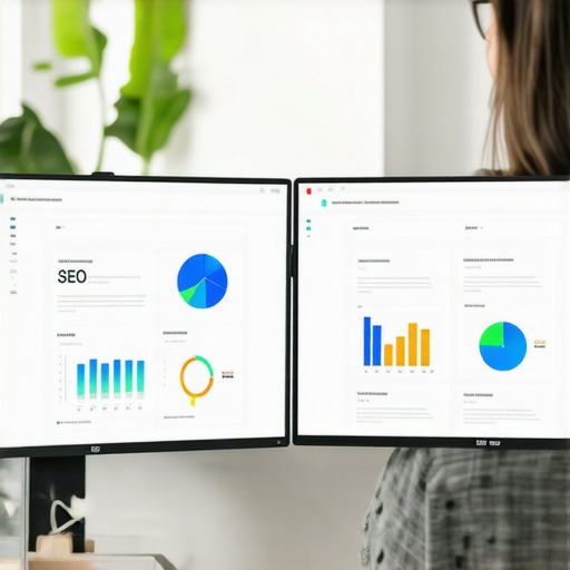
Maintenance isn’t just about fixing what’s broken; it’s about protecting your ROI. When I’m auditing a brand today, the first thing I look at is the connection between their visual identity and their data. If you aren’t using tools like Hotjar or Microsoft Clarity to see where people are actually clicking, you are just guessing. I’ve seen companies waste thousands because they didn’t realize the CSS fix that saved our mobile checkout flow was actually more important than their new logo. You need to be obsessed with the ‘plumbing’ of your site. I personally use Screaming Frog once a month to crawl every site I manage. It’s a bit like a medical check-up for your domain. It finds the redirected chains and the missing alt text that humans simply can’t see with the naked eye.
How do I maintain my brand edge without starting over?
The secret is incremental shifts rather than total overhauls. You should be running micro-tests on your high-traffic pages. For example, in your advertising, you might find that proven PPC advertising tactics require you to swap out your ‘brand-perfect’ hero image for something a bit more raw and authentic to see a boost in conversion. This constant refinement is what separates the legacy brands from the flashes in the pan. According to the official Google Search Central documentation on Core Web Vitals, the Largest Contentful Paint (LCP) should occur within 2.5 seconds, and staying within that threshold requires constant monitoring of how your brand assets—like high-res videos—are being delivered to the user.
The Tools That Keep My Sanity Intact
If you aren’t using a schema validator, you are leaving money on the table. I can’t tell you how many times I’ve helped a business double their click-through rate just by showing them how to fix the schema errors blocking your rich snippets. It makes your search result look professional and authoritative before the user even lands on your page. This is the new frontier of branding mastery and building a distinct identity. Your brand isn’t just what people see on your homepage; it’s how you appear in the automated snippets of a Google search. I also swear by SEMrush for monitoring ‘brand sentiment’ and keyword fluctuations. If you see your main service keywords dipping, it’s an early warning sign that your technical foundation is wobbling.
Predicting the Move to Hyper-Personalized Visuals
Looking ahead to 2025 and beyond, the biggest shift we are seeing is the death of the ‘one-size-fits-all’ website. I predict that we will soon see web design ideas that drive conversions based on real-time user data. Imagine a site that subtly changes its color palette or layout based on the specific search intent of the visitor. We are moving toward a world where advanced techniques for marketers will include AI-driven visual adjustments that happen in milliseconds. If your current brand identity is too rigid to handle that kind of flexibility, you’re going to get left behind. Don’t wait for your traffic to bottom out before you take action. Pick one tool—whether it’s a speed tester or a heat map—and run it on your top-performing page today. You might be surprised at what is actually standing in the way of your next sale.
Lessons from My Most Expensive Visual Failures
Looking back at that neon green disaster from my early days, the biggest takeaway wasn’t just about color—it was about detachment. You have to detach your ego from the design to see what the user actually sees. Here are the hard truths I’ve gathered after a decade in the weeds:
- Design is a hypothesis, not a decree: No matter how much you love a layout, if the heat maps show users are ignoring your CTA, the design is functionally broken.
- Speed is the ultimate brand signal: A luxury brand that takes 8 seconds to load feels like a cheap knock-off. In 2025, high-end is synonymous with high-performance.
- Accessibility creates instant authority: When you prioritize inclusive design, you aren’t just being ‘nice’; you are signaling to Google and your audience that your brand is robust, professional, and reliable.
I’ve realized that branding mastery and building a distinct identity is less about finding the perfect shade of blue and more about removing every single friction point between your customer and their goal.
The Tech Stack That Saves My Design Sanity
I don’t make decisions based on gut feelings anymore. To keep my sanity and my clients’ ROI, I rely on a tight circle of tools that never lie. If you want to unlock technical SEO secrets to boost your ranking, you need the right binoculars for the job.
First, Screaming Frog is my non-negotiable for monthly audits. It is how I catch the crawl error that was hiding our new product line before it impacts the bottom line. Second, I use Adobe Color to test contrast ratios against WCAG standards to avoid the contrast ratio mistake making your site unreadable. Finally, Google Search Console is my daily source of truth. It’s where I see if my creative header changes are actually helping or hurting my organic visibility in real-time.
Your Path to a Website That Actually Works
It is time to stop treating your site like a static trophy and start treating it like the conversion engine it was meant to be. Whether you are refining your branding strategies that define your business identity or diving deep into a server log analysis, the goal remains the same: clarity and trust. Don’t be afraid to break your ‘perfect’ aesthetic if it means making the experience better for a real human being. The most successful brands are the ones that evolve alongside their data. Take that first step today—audit your mobile menu or check your site speed—and watch how much faster your leads start coming in. Have you ever had a ‘pretty’ design element that you realized was actually killing your conversions? I’d love to hear your stories in the comments!