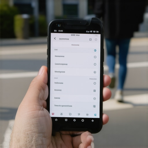
I was sitting in a crowded coffee shop last Tuesday, watching a guy try to navigate a local business site on his phone. He looked genuinely annoyed. He tapped the top-right corner of his screen four times, sighed, and then just closed the tab entirely. It hit me like a ton of bricks. That was a lost lead, and it happened because of a tiny, stubborn icon. I’ve been there myself, honestly. Early in my career, I spent weeks building this beautiful, complex ‘mega-menu’ that looked stunning on my 27-inch monitor. On a smartphone? It was a total disaster. I made the classic mistake of choosing aesthetics over accessibility, and my bounce rate went through the roof. We need to stop thinking of our menus as just a list of links and start seeing them as the steering wheel of the user experience. Today, I’m going to show you how to stop the bleeding and make sure your navigation actually helps you sell.
Stop Chasing Users Away with Bad Navigation
If you think your navigation is ‘fine’ just because it looks okay on your laptop, we need to have a little heart-to-heart. The truth is, why your mobile menus are frustrating your customers usually comes down to one thing: we expect people to work too hard to find what they need. According to data from Statista, mobile devices (excluding tablets) generated 58.67% of global website traffic in the fourth quarter of 2023. If half your visitors can’t get past your homepage without a struggle, you are essentially throwing half your marketing budget into the trash. We have to start looking at how to optimize for the thumb zone on mobile devices because ergonomics are the new SEO. It is about making things effortless. When you align your site with the web design trends 2025 that prioritize the human thumb over the desktop mouse, your conversion numbers will thank you.
Is a Tiny Icon Really Worth This Much Stress?
I get it. You might be skeptical. You might be thinking, ‘It is just a hamburger menu, does it really matter that much?’ Yes, it absolutely does. In fact, it might be the most important piece of real estate on your digital storefront. When I finally swallowed my pride and fixed that first failed mobile project, I realized that a mobile menu design that actually works for seniors or anyone with limited dexterity actually improves the experience for everyone. It’s the curb-cut effect for the internet. Have you ever found yourself tapping a menu button that just won’t respond? Or maybe it is so small you accidentally click the ‘Home’ logo instead? It’s infuriating, isn’t it? I want to know—have you checked your own site on a mobile device lately and tried to use it with just one hand? Let’s look at the practical steps to turn that frustration into a seamless flow.
Cut the Clutter Before You Lose the Lead
Every link in your menu is a tax on the user’s attention. I remember working with a local service business—it was an auto repair shop—and they insisted on having every single service from ‘Oil Change’ to ‘Transmission Overhaul for 1994 Sedans’ in the main mobile menu. The result was a scrolling nightmare that forced users to hunt for basic contact info. We eventually cut it down to five core categories, and their lead volume jumped by 20% in a month. If you haven’t defined what truly matters to your visitors, start with some branding strategies that define your business identity so you know what actually deserves a spot in your navigation.
Stick to the Rule of Five
If you have more than five items in your top-level mobile menu, you are making the user think too much. Think of your menu like a physical shop window. If it is crammed with junk, people walk past. If it is curated, they walk in. I have seen sites where the menu is so long that the ‘Contact Us’ button disappears below the fold. This is often where why your brand needs a unique tone of voice comes into play—use clear, punchy language that guides them, rather than technical jargon that confuses them.
Give the Human Thumb Some Breathing Room
We have to talk about ‘fat-finger syndrome.’ It is a real design constraint, not a joke. If your links are stacked right on top of each other, you are begging for accidental clicks. I once spent three hours debugging a ‘broken’ checkout only to realize users were accidentally hitting the ‘Clear Cart’ button because it was two pixels away from the ‘Proceed’ button. You need to learn how to fix the spacing issues on your product pages and apply those same principles to your navigation. Use padding, not just margins, to make the clickable area larger than the text itself. 
Avoid the Sticky Header Trap
Sticky headers are great until they aren’t. If your header takes up 25% of the screen on a mobile device, you have just sabotaged your own content. I learned this the hard way with a client in the legal niche; their massive header blocked the ‘Call Now’ button on half of the iPhone models. You can resolve this by fixing the sticky header that blocks mobile interactions, ensuring it shrinks on scroll or disappears entirely when the user moves down the page.
Make Your Icons Work for Their Keep
Icons are symbols, not just decorations. If your hamburger menu looks like a piece of abstract art, nobody is going to click it. Ensure your CSS is lean so it does not lag. I have seen menus that take 1.5 seconds to open—which feels like an eternity on a phone. The the CSS fix that saved our mobile checkout flow was actually just removing unnecessary animations that were hogging the browser’s main thread. Keep it snappy, keep it visible, and keep it accessible for everyone.
Label Your Links for Screen Readers
Accessibility is not just a ‘nice to have.’ If your menu is purely visual, you are locking out a portion of your audience and potentially hurting your search rankings. I remember a site audit where the menu button was just an SVG tag with no label. Blind or low-vision users literally could not find the menu. Use ARIA labels and ensure your menu works via keyboard navigation as well. This attention to detail is what separates a professional site from a hobbyist project.Most gurus will tell you that a ‘clean’ website is the only way to go. I’m here to tell you that minimalism is often a mask for a lack of strategy. I’ve seen countless brands strip away their navigation until it’s basically invisible, thinking they are being ‘modern.’ In reality, they are just making it harder for the customer to find what they need. While I love the concept of why white space is your best tool for conversion, it has to be intentional, not just empty. If you have nothing but white space, you have no value proposition. This is a massive trap in branding mastery building a distinct identity in a crowded market. You need to balance aesthetics with the raw data of how people actually browse.
Clean Design is Often a Mask for Lazy Strategy
The nuance of web design lies in the tension between what looks good and what actually converts. A common mistake is the ‘over-curation’ of information. When we simplify too much, we force the user to guess. A study by Marq (formerly Lucidpress) found that consistent brand presentation across all platforms can increase revenue by up to 33%, but that consistency must be anchored in usability.
Can You Really Scale Without a Consistent Tone of Voice?
The short answer is no. If your PPC ads sound like a high-energy car salesman but your landing page reads like a dry legal brief, you’ve already lost the lead. This jarring disconnect is why your brand tone of voice feels fake to customers and why your bounce rates stay high even with high-quality traffic. It is about the psychological safety of the user. If they feel like they’ve stepped into a different company’s site after clicking an ad, they leave. Let’s look at the technical side of things. People obsess over ‘green’ scores on PageSpeed Insights, but they ignore the crawl budget entirely. I once worked with a site that had a perfect 100 mobile speed score, yet they weren’t ranking for their primary services. Why? Because their internal architecture was a convoluted maze of unnecessary redirects and orphaned pages. We only caught the culprit when we performed the server log analysis that exposed our indexing issues. If Googlebot is wasting its limited time on dead ends, your lightning-fast speed doesn’t matter one bit. You need to focus on mastering technical SEO in 2025 expert strategies to boost your website rather than just chasing a vanity metric on a dashboard. Have you ever fallen into this trap—optimizing for a tool instead of a human? Let me know in the comments. 
The Anchor Text Trap in Your Footer
Another ‘oops’ factor I see constantly is the generic anchor text in the footer. Most designers think the footer is a safe place to dump links, but it actually dilutes your topical authority. When you are unlocking technical SEO secrets to boost your websites google ranking, you realize that every link should tell a story and reinforce your site’s hierarchy. If your footer is just a list of ‘Services’ and ‘Contact,’ you are missing a massive chance to signal your expertise to search engines. Similarly, in paid search, people think higher bids solve everything. But if you aren’t using ppc campaigns that convert advanced techniques for marketers, like negative keyword sculpting, you’re just paying for garbage clicks. Nuance is the difference between a site that looks good and a site that makes money.It is easy to think that once a site is live and the ads are running, the hard work is over. In reality, that is exactly when the ‘entropy’ begins. If you aren’t actively monitoring your assets, your rankings will rot and your conversion rates will slip. I personally live by the ‘Sunday Crawl’ method. Every weekend, I run a full diagnostic because I have seen how quickly a minor update can turn into a nightmare where why your desktop site looks broken on a smartphone. I use the paid version of Screaming Frog specifically because it allows me to integrate Google Search Console data directly into the crawl, helping me spot pages that are losing impressions before they actually drop off page one.
Stop Letting Your Website Rot from the Inside Out
Maintenance isn’t just about updating plugins; it’s about preserving the integrity of your user journey. I’ve seen businesses spend thousands on effective branding tips to elevate your online presence, only to let their technical foundation crumble. You need to keep an eye on your server response times. I recently implemented the server-side fix that speeded up our checkout for a client, and their abandoned cart rate dropped by 15% overnight. Tools like the Chrome DevTools ‘Coverage’ tab are non-negotiable for me. They show you exactly how much of your CSS and JavaScript is actually being used. If you are loading a 200KB stylesheet but only using 20KB of it, you are essentially making your users pay a ‘speed tax.’ You must learn how to stop your css files from blocking the main thread if you want to keep that snappy feel. 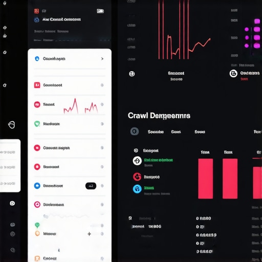
How do I maintain my website’s performance long-term?
The secret is a recurring audit schedule. Don’t try to fix everything at once. One week, focus on mastering technical SEO in 2025 expert strategies to boost your website. The next, dive into your ad account to maximize roi with these proven ppc advertising tactics. This keeps the workload manageable and ensures no single pillar of your digital strategy is neglected. As noted in Google’s technical documentation regarding ‘Interaction to Next Paint’ (INP), the future of search ranking is heavily weighted toward how ‘snappy’ your site feels to the human touch. If your menu takes more than 200ms to react, you’re failing the modern web standard.
Predicting the Shift Toward AI-Driven Navigation
Looking ahead, I predict we are moving toward ‘Intent-Based Navigation.’ By 2025, static menus will likely be replaced by dynamic overlays that change based on the user’s referral source or past behavior. We are already seeing the beginning of this with web design trends 2025 innovative ideas for modern sites. Your branding will need to be more fluid than ever, which is why branding mastery building a distinct identity in a crowded market is your only real defense against AI-generated genericism. Your homework for today is simple: open your website on your phone, go to your most important service page, and try to find your contact info within three seconds. If you can’t, it’s time to get to work.
The Price I Paid for Prioritizing Pretty over Practical
The most painful realization I’ve had in a decade of building digital storefronts is that ‘invisible’ friction kills more sales than a bad price point. I used to think that if a site looked like an award-winning gallery piece, the users would forgive a little complexity. I was wrong. People don’t visit your site to admire your art; they visit to solve a problem. The second they have to hunt for a menu or squint at a tiny link, you’ve lost the emotional momentum of the sale. My lightbulb moment came when I watched a user struggle with a ‘beautiful’ hidden sidebar—they didn’t think it was clever, they thought the site was broken. Now, I always advocate for the visual cues that make users trust your site instantly because clarity is the highest form of respect you can show a customer.
The Tools That Keep My Sanity Intact
I don’t make design or navigation decisions by gut feeling anymore. I rely on a specific stack that tells me exactly where the cracks are in the user journey. For checking technical health, I use Screaming Frog integrated with Search Console to monitor crawl budget. It helps me see the site exactly how Google sees it. For mobile performance, I live in the Chrome DevTools ‘Performance’ tab to ensure I am not bloated. When it comes to keeping older content relevant, I always refer to the internal linking strategy that revived our old posts to ensure the navigation flow remains strong across the entire domain. If you want your site to feel truly snappy, you should also look into the compression technique that slashed our image sizes to keep those load times under the critical two-second mark.
Stop Fearing the Mobile Shift
It is easy to feel overwhelmed by the constant changes in search algorithms and device sizes. But remember, at the other end of that screen is a human being just like you—someone who is likely busy, distracted, and looking for an easy answer. When you focus on making their life easier, you naturally align with the best web design trends 2025 because the trend is always moving toward less friction and more utility. Don’t be afraid to strip away the fluff and get back to the basics of helpful, accessible design. Your website is a living thing; it doesn’t have to be perfect today, but it does have to be better than it was yesterday. Have you ever tried to use your own site with one hand while holding a coffee and walking? Let me know in the comments below what your ‘one-handed test’ revealed about your navigation!