
I remember sitting in a coffee shop three years ago, staring at a portfolio site I’d just finished. I was so proud of that “minimalist” look—delicate light-gray fonts on a clean white background. It felt high-end. It felt sophisticated. Then, a potential client tried to open it on his phone while standing outside in the sun. He squinted, tilted his screen back and forth, and eventually just sighed and closed the tab. That was my wake-up call. I hadn’t just made a stylistic choice; I had built a digital wall between my content and my audience. This is the contrast ratio mistake making your site unreadable, and it’s likely costing you more money than you realize.
The Day I Realized My Minimalist Design Was Actually Just Invisible
We often get so caught up in the visual cues that make users trust your site instantly that we forget the most basic requirement of any interface: legibility. Early in my career, I prioritized “vibe” over function. I thought accessibility was just for a small percentage of users, but I was dead wrong. According to the WebAIM Million report, low contrast text is the number one accessibility failure found on the web, appearing on 81% of home pages. This affects nearly everyone at some point—whether they have a permanent visual impairment or are just trying to read a blog post on a glare-heavy smartphone. When your text fades into the background, your message dies right there on the screen. It doesn’t matter how great your web design trends for 2025 are if nobody can see them. I spent weeks wondering why my bounce rates were so high, only to realize I was literally driving people away with my color choices. Today, I’m going to walk you through exactly how to spot these traps before they hurt your brand. Have you ever found yourself squinting at a site you designed and thinking, “Wait, is this actually readable?”
Does meeting these standards actually help my bottom line?
There’s a common fear that “accessible” means “ugly.” I used to believe that following WCAG guidelines meant I was stuck with boring, high-contrast black and white forever. It’s a myth that keeps many talented designers from building better sites. In reality, fixing your contrast is one of the fastest ways to improve user experience across the board. It’s not just about compliance; it’s about clarity. If your users can’t read your call-to-action button, they aren’t going to click it. We’re going to solve this by moving away from the “gray-on-white” epidemic and embracing palettes that pop without being an eyesore. [image placeholder]
Measure Your Way Out of the Gray Fog
To fix a problem, you first have to admit you have one. In the design world, we often use our calibrated, high-end monitors in dimly lit offices to judge our work. That is a massive mistake. Your users are in the real world. I once worked with a client who insisted on using a very faint silver for their secondary navigation. It looked beautiful in the Figma file. But when we looked at the data, nobody was clicking those links. We realized that for anyone over the age of 40, or anyone using a budget phone screen, those links were essentially invisible. This is exactly why your desktop site looks broken on a smartphone when the environment changes. We didn’t just need a better ‘vibe’; we needed a ruler. You need to treat contrast ratio like a vital sign for your site’s health.
Aim for the 4.5 to 1 Sweet Spot
The Web Content Accessibility Guidelines (WCAG) aren’t just suggestions; they are the blueprint for a functional site. For standard text, you need a contrast ratio of at least 4.5:1 against its background. If you’re dealing with large text or bold headers, you can sometimes get away with 3:1, but why take the risk? Think of your text like a conversation in a crowded bar. If you whisper (low contrast), you’ll be ignored. If you speak clearly and at the right volume (high contrast), people actually hear your message. When you how to choose a color palette that fits your industry, you must prioritize these ratios over your personal preference for ‘soft’ aesthetics. I’ve seen beautiful brands fail because they were too shy to use a bold font color. Using a tool like the Adobe Color Contrast Analyzer or a simple browser extension can tell you instantly if your ‘sophisticated’ gray is actually a conversion killer.
Build a Contrast-First Style Guide
Don’t wait until the site is coded to realize your colors don’t work. Start by defining your primary and secondary text colors early. I remember a project for a financial firm where we struggled with a simple layout fix that makes your swiss loan calculator convert more users. The problem wasn’t the math; it was that the input labels were too light. Users were getting lost in the form because they couldn’t distinguish the fields from the background. We went back to their effective branding tips to elevate your online presence and added a ‘high-visibility’ black to their palette specifically for UI elements. It didn’t ruin the brand; it made the brand usable. You should always test your palette against different backgrounds—white, light gray, and dark mode—to ensure that your visual cues that make users trust your site instantly are actually visible to the human eye. If a color fails the test, ditch it. No ‘aesthetic’ is worth a 20% drop in leads.
Test Your Design Under the Worst Conditions
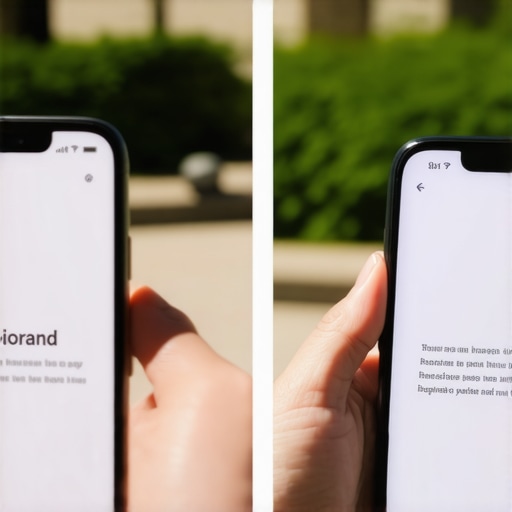
The ultimate test isn’t your desktop; it’s a mobile device at 50% brightness in a park. I make it a habit to take my prototypes outside. If I can’t navigate the menu while walking in the sun, the design is a failure. This physical testing often reveals issues that automated tools miss, like how your mobile users are clicking the wrong buttons because the touch targets are poorly defined or the contrast between the button and the background is too muddy. It’s about creating a frictionless experience. Every time a user has to squint, you are adding friction. In web design trends for 2025, we are seeing a move back toward high-clarity interfaces because designers are finally realizing that ‘invisible’ isn’t a style—it’s a bug. You want your content to pop, not hide.
The Dark Mode Trap You Didn’t See Coming
There is a prevailing myth that simply adding a ‘Dark Mode’ toggle solves all your accessibility woes. I’ve seen countless designers flip their palette to pure black (#000000) and pure white (#FFFFFF), thinking they’ve reached the peak of usability. In reality, they might be making things worse. For users with astigmatism—which, according to some estimates, affects nearly 1 in 3 people—high-contrast white text on a black background causes a ‘halation’ effect. The letters appear to bleed or glow, making the text harder to read than standard dark-on-light. This is where effective branding tips to elevate your online presence often clash with technical reality. True expertise lies in finding the ‘soft high contrast’—using deep charcoals and off-whites that pass WCAG but don’t vibrate on the screen.
Can extreme contrast actually drive users away?
While we obsess over the 4.5:1 ratio, we often ignore the cognitive load of ‘visual noise.’ If every element on your page is screaming for attention with maximum contrast, nothing stands out. I once audited a site that had perfect accessibility scores, yet the bounce rate was astronomical. Why? Because the interface was so sharp it was physically painful to look at for more than two minutes. A study by the Nielsen Norman Group highlights that readability isn’t just about color; it’s about how those colors interact with white space. If you don’t leverage white space as a tool for conversion, your high-contrast text just becomes a wall of clutter. 
Stop Trusting Your Automated Accessibility Score
Here is the ‘oops’ factor that catches even senior devs off guard: over-reliance on automated tools. Tools like Lighthouse or Axe are fantastic, but they have a massive blind spot. They struggle to accurately calculate the contrast of text sitting on top of images, gradients, or semi-transparent overlays. I’ve seen ‘compliant’ sites where the text was completely washed out because the automated tool only read the CSS background color, not the busy hero image behind it. This is a classic alt text mistake that hurts your image rankings and your user experience simultaneously. When these bots scan your site, they are essentially looking at the code, not the rendered reality your customer experiences. If you aren’t manually checking your layers, you are leaving your reputation to chance. You might also find that spacing issues on your product pages are exacerbated by high contrast, making your layout feel cramped and ‘cheap.’ Have you ever fallen into the trap of chasing a perfect 100/100 score while ignoring how the site actually feels to a human? Let me know in the comments.
Why Your Letter Spacing is Destroying Your Readability
Finally, let’s talk about the nuance of ‘kerning’ in a high-contrast environment. When you increase contrast, any tightness in your lettering becomes much more obvious. If your characters are too close together, the high contrast makes them ‘blob’ together at small sizes. This is especially true when you optimize for the thumb zone on mobile devices, where screen real estate is at a premium. It’s a subtle art. In branding, we talk a lot about why your brand needs a unique tone of voice, but we rarely discuss the ‘visual voice’ of your typography. High contrast without proper leading and kerning feels aggressive. By loosening the tracking on your headers, you allow the high-contrast colors to breathe, turning a potential eye-strain issue into a mark of sophisticated design. Don’t just settle for ‘legal compliance’—strive for an effortless experience.
The Tools That Saved My Eyes and My Analytics
I don’t just eyeball colors anymore because, frankly, my monitor is a liar. I rely heavily on the Stark plugin in Figma for my day-to-day design work. It’s my go-to because it simulates various color blindness types and checks contrast in real-time before I even hand off a design to developers. If you’re already live, the WAVE browser extension is brutal but necessary—it catches those tiny, overlooked areas where your text might be clashing with a background image or a gradient. This isn’t just a stylistic preference for designers; if you are running paid traffic, this is a PPC landing page tweak that lowered our bounce rate significantly because people could actually find the ‘Buy’ button without a search party. 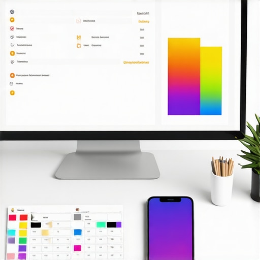
How do I keep my site readable as I add more content?
Maintenance is the silent killer of great design. You launch a perfect site, but then three months later, a junior editor uploads a hero image with no overlay and places white text on top of it. Suddenly, your accessibility score tanks. I recommend creating a ‘Living Style Guide’ that explicitly lists your approved color pairings. This ensures that consistency remains the secret to a memorable brand even as your team grows. You should also bake a quick accessibility check into your monthly technical audit. When mastering technical SEO in 2025, don’t just look at the code; look at the user interface through the lens of legibility. As accessibility expert Adrian Roselli often points out in his technical documentation, accessibility is a continuous process, not a checkbox you tick during launch. If you treat it like a one-time task, you’re essentially waiting for your site to break for your users.
Adaptive Design is the Next Frontier
Looking ahead, I predict we are moving toward ‘context-aware’ interfaces that don’t just respond to screen size, but to the environment. We’re already seeing early versions of this in the future of web design and emerging technologies, where CSS will eventually automatically adjust text contrast based on the user’s ambient light sensors or their specific vision profile. Until that becomes standard across all browsers, you need to be proactive. If you want to master technical SEO from crawlability to site speed optimization, you must include UX metrics like readability in your performance reports. High contrast doesn’t just help human users; it helps search engines understand the visual hierarchy and importance of your information. My challenge for you today is simple: Take your top-performing sales page and run it through the WebAIM Contrast Checker. If your primary Call to Action has a ratio below 4.5:1, change the color immediately. It is the single fastest way to turn a ‘bounce’ into a ‘lead.’
Lessons from the Gray Font War
Looking back, I wasted hundreds of hours chasing a ‘clean’ aesthetic that was actually just dysfunctional. One thing I learned the hard way: if you design for the edge cases—the user in the sun, the senior with fading vision, or the person on a cracked screen—you actually improve the experience for everyone else. It’s a universal lift. I also realized that why white space is your best tool for conversion isn’t just about ’empty’ room; it’s about giving your high-contrast elements the stage they need to perform. I used to think accessibility was a chore, but now I see it as the foundation of premium UX. Don’t fear the bold; fear the invisible.
The Sharpness Toolkit I Use Daily
I no longer trust my own vision to judge compliance. I lean on the Stark plugin for Figma because it catches contrast errors before I even hit ‘export.’ I also regularly use the WAVE Web Accessibility Evaluation Tool to audit live pages and spot issues that automated scans might miss. For deeper strategy, I dive into mastering technical SEO from crawlability to site speed optimization to ensure my highly legible text is actually being indexed and rendered correctly. Lastly, I always keep the WCAG 2.1 documentation bookmarked—it is not a dry read if you view it as a guide to making more money through better usability.
Your Design is Only as Good as it is Visible
At the end of the day, your website is a bridge between your business and your customer. If that bridge is hard to see, people simply won’t cross it. By fixing the contrast ratio mistake making your site unreadable, you are choosing to be seen. You are choosing clarity over ego and results over ‘vibes.’ As you apply these effective branding tips to elevate your online presence, remember that the most memorable brands are the ones that are effortless to engage with. Don’t let a silver font stand in the way of your next big sale. Have you ever looked at your site on a mobile device outdoors and realized you couldn’t read your own headlines? Let me know your ‘wake-up call’ moment in the comments below.