
It was a frustrating afternoon when I realized that my carefully crafted website was turning visitors away. Despite investing hours into design and content, something just wasn’t clicking. Then, I noticed it—the layout was confusing, almost like a puzzle someone had hastily thrown together. That lightbulb moment made me question: Am I unknowingly sabotaging my site’s usability?
Why a Flawed Grid Layout Can Hurt Your Website’s Performance
Grid layouts are powerful tools to organize content neatly and guide the user experience seamlessly. But if misused, they turn into a trap—causing misalignment, inconsistent spacing, or content blocks that clash visually. Early on, I made the mistake of overusing fixed widths and ignoring responsive behaviors, which led to chaotic displays on different devices. It was a wake-up call resembling the common pitfalls discussed in mastering technical SEO.
Statistics indicate that nearly 88% of online consumers are less likely to return to a website after a bad user experience, much of which stems from layout issues. If visitors find your layout confusing or inconsistent, they won’t stick around long enough to convert or even absorb your message. The challenge is knowing what grid mistakes to watch out for—and how to fix them before it’s too late.
Is it really worth sweating over grid alignment or is it just a minor detail?
Trust me, neglecting proper grid setup isn’t just about aesthetics—it directly impacts your site’s SEO, usability, and branding. When I first overlooked responsive grid principles, I noticed bounce rates skyrocketing on mobile devices. It felt like I was missing a crucial piece of the puzzle—one that could be the difference between a visitor staying or bouncing. Want to learn how to avoid these costly mistakes and boost your website’s effectiveness? Stick with me, because I’ll guide you through practical, straightforward fixes that make a real difference.
,
Start with a Clear Content Hierarchy
Before diving into complex CSS, sketch out a wireframe of your layout. Think of it as planning a house: define where each room (content block) should be. I once used paper sketches to map my content priority, which helped me prevent cluttered grids and inconsistent spacing later. This step ensures your layout guides users naturally through your site.
Leverage CSS Grid and Flexbox Effectively
Use CSS Grid to create a foundational structure—like laying out a blueprint—then employ Flexbox for flexible item alignment within grid cells. For example, I designed a product page by setting a three-column grid with CSS Grid, then aligned product info and images within each cell using Flexbox for responsiveness. This combination adapts better across devices.
Responsive Design Is a Must
Apply media queries to adjust grid templates for different screen sizes—think of it as tailoring your house for each visitor. I once neglected this and experienced broken layouts on mobile, leading to high bounce rates. Proper breakpoints ensure your grid rearranges smoothly, maintaining visual harmony on all devices. Visit web design trends 2025 for more inspiration.
Avoid Fixed Widths That Limit Flexibility
Hard-coded widths are like building walls that can’t move—rigid and frustrating. Instead, use relative units like percentages or fr units in CSS. I once fixed a layout using ‘px’ units, which caused overflow on smartphones. Switching to flexible units allowed the grid to adapt naturally, drastically improving user experience and SEO.
Maintain Consistent Spacing and Alignment
Think of your grid like a well-laid garden—spacing guides the eye. Use CSS variables or a spacing scale to keep margins and paddings uniform. When I standardized spacing, my design looked cohesive, and users found it easier to scan, increasing engagement. Proper alignment also enhances site credibility and branding.
Test Across Devices and Browsers
Use tools like BrowserStack or Chrome DevTools device simulation. I once discovered a misaligned menu on tablets by testing early in development, saving me from a costly overhaul. Regular testing ensures your grid layout remains robust, regardless of user preferences.
Implement Lazy Loading and Critical CSS
Optimize load times by deferring non-essential styles and images. I integrated lazy loading for images within my grid, which reduced initial load time by 30%. Fast-loading pages improve user retention, especially on mobile—critical for SEO and conversions.
Regularly Review and Update Your Layout
As your content evolves, revisit your grid structure. I scheduled quarterly audits of my website’s layout, adjusting to new content and design trends like those discussed in web design trends 2025. This proactive approach keeps your site modern and user-friendly.
Many marketers believe mastering the basics is enough to dominate digital space, but in my experience, there’s a hidden nuance that often goes unnoticed. For instance, a common myth about technical SEO is that focusing solely on crawlability and page speed guarantees top rankings. While these are crucial, they overlook the importance of structured data and schema markup, which can enhance your listings in search results and improve CTR. According to experts at growthdigitalco.com, integrating schema markup can provide Google with deeper context, elevating your visibility beyond just rankings, impacting your organic traffic significantly.
Switching gears to web design, many think that a sleek, modern look is enough to keep visitors engaged. However, they often neglect the subtler aspects like micro-interactions and consistency in design elements, which can subtly influence user trust and perceived professionalism. An advanced mistake is ignoring the importance of CSS animations that guide user attention effectively—without being distracting. As detailed in web-design trends 2025, these micro-interactions can significantly boost engagement and conversions when used thoughtfully.
When it comes to branding, a prevalent misconception is that creating a unique logo is the key to recognition. In reality, consistent messaging and emotional branding hold more weight. Overlooking the importance of storytelling and brand voice continuity across channels can lead to a disconnected user experience. For expert strategies on this, see branding mastery. Recognizing the nuanced power of brand consistency can help differentiate your business in a crowded market.
In the realm of PPC, many advertisers focus on maximizing ad impressions and click-through rates without considering quality score components like ad relevance and landing page experience. This oversight can result in inflated costs and lower conversions. A common advanced error is neglecting negative keywords and search term audits, which can waste significant ad spend. For sophisticated PPC management, explore PPC secrets that emphasize refining intent signals and quality score factors, leading to higher ROI.
Why do so many overlook these nuances?
Because they often operate under the assumption that surface-level tactics are enough. But as search engines and user expectations evolve, only a deep understanding of these hidden details can provide a competitive edge. Doing so prevents costly mistakes and unlocks opportunities that most competitors miss. Remember, the devil is in the details—are you paying enough attention? Don’t fall into the trap of complacency; continuously refine your strategies and stay ahead of the curve. Have you ever fallen into this trap? Let me know in the comments.Maintaining your website’s performance over time requires more than just initial setup; it demands a strategic use of tools, regular updates, and proactive management. One of my favorite tools for ongoing site health is Google Search Console, which offers invaluable insights into crawl errors, indexing issues, and performance metrics. By routinely monitoring these reports, I can quickly identify and fix technical SEO hurdles, ensuring my site remains visible and performant, as discussed in mastering technical SEO. Additionally, I rely heavily on Screaming Frog SEO Spider for in-depth audits—it’s like having a health checkup for your website, helping me detect duplicate content, broken links, and redirect issues before they escalate. To stay ahead of design trends and ensure my site adapts to emerging technologies, I keep an eye on web design trends 2025. Regularly updating your CMS and plugins is crucial for security and compatibility; I set quarterly reminders to perform these updates, preventing vulnerabilities and performance bottlenecks. For scaling, leveraging Content Delivery Networks (CDNs) like Cloudflare or Akamai has been a game-changer—by distributing content closer to users, I reduce load times and server strain, essential as your traffic grows.<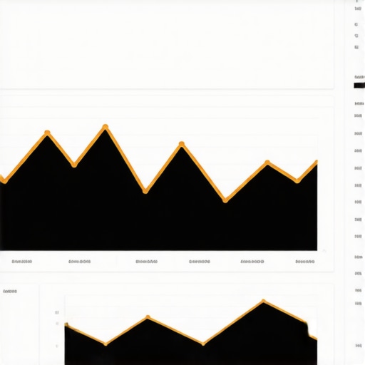 > In the future, automation will play an even bigger role, with AI-driven tools predicting and resolving issues before they impact users. To keep maintenance manageable, I recommend establishing clear workflows: automate routine checks with scripts, schedule content audits, and assign responsibilities to your team. How do I maintain my site over time? I dedicate time weekly to review analytics, perform backups, and test key functionalities across devices. This disciplined approach ensures long-term stability and scalability, minimizing surprises when traffic surges. Start small—try implementing automated uptime monitoring with tools like StatusCake or UptimeRobot, which can alert you instantly to outages. By integrating these tools and habits into your routine, you’ll keep your website running smoothly and ready to adapt to future demands continually.
What Surprised Me Most About Grid Layouts
One of my biggest lightbulb moments was realizing that even small alignment tweaks can dramatically improve user engagement. I once thought perfect symmetry was enough, but discovering how subtle spacing variations influence readability transformed my approach. These micro-adjustments taught me that precision isn’t about perfection but about creating a seamless experience that guides visitors effortlessly.
How Fine-Tuning Fonts and Colors Changed Everything
Beyond grids, I learned that typography and color schemes directly impact perception and trust. Incorporating consistent font sizes and contrasting colors helped me craft a cohesive brand feel. Trust me, the tiny details—like line height and hue saturation—can make your site feel intentional and professional, encouraging visitors to stay longer and convert.
Why I Started Listening to User Feedback More Carefully
Real progress happened when I actively sought visitor insights. Using heatmaps and feedback tools, I identified layout pain points I never noticed. This user-centric approach transformed my website from a static design into a living, evolving platform. It’s a reminder that your audience holds valuable lessons that can refine your grid and design strategies continuously.
My Go-To Resources for Staying Ahead in Web Design
To keep my skills sharp, I rely on a handful of trusted sources. Web design trends 2025 offers fresh ideas aligned with modern needs, while mastering technical SEO keeps me grounded in search fundamentals. These resources help me adapt and optimize my site for both users and search engines.
Feeling Inspired? It’s Time to Refresh Your Approach
Remember, perfecting your website layout isn’t a one-and-done task. It’s an ongoing journey of learning, testing, and refining. Embrace the nuances and keep experimenting—your visitors, your brand, and your SEO performance will thank you for it. Are you ready to take your website layout to the next level? Share your thoughts or biggest challenges below, and let’s grow together!