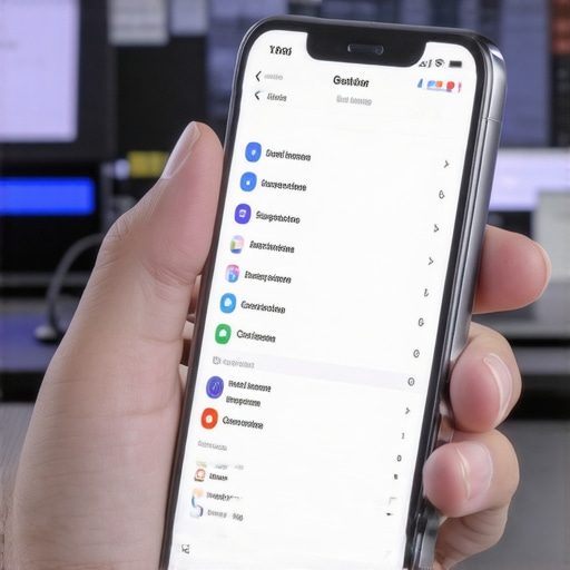
I remember the exact moment I realized my website was turning away visitors like an unwelcoming bouncer. It was a busy Thursday afternoon, and I watched in dismay as spikes in traffic just vanished on mobile devices. Turns out, my sleek, hamburger-style menu was more of a barrier than a bridge. That lightbulb moment changed everything—because I understood that a tiny design element was silently sabotaging my traffic and conversions.
The Hidden Barrier in Your Mobile Menu
For months, I was fine-tuning my content, optimizing keywords, building backlinks—basically doing all the things you expect from a good SEO strategy. But my traffic stagnated, especially from mobile users. It wasn’t until I dug deeper that I discovered an unsettling truth: many visitors simply couldn’t navigate my menu. They clicked, hesitated, or gave up entirely, increasing my bounce rate and leaving money on the table. It made me ask, how many visitors are we unintentionally pushing away with poor mobile navigation?
According to a 2023 report by Growth Digital Co., nearly 70% of online shoppers abandon sites due to bad mobile experiences. That’s a staggering number—and it means that your mobile menu could be the silent culprit behind significant lost revenue.
Could Your Menu Be the Problem?
Early on, I made a critical mistake: I assumed that a hamburger icon was sufficient. I didn’t realize that this common design choice could hide crucial navigation links, especially for users who are in a hurry or unfamiliar with the icon’s purpose. As a result, my visitors were confused or frustrated, leading to higher bounce rates. Once I recognized this mistake, I started testing more user-friendly options, which dramatically improved engagement. Trust me, it’s not just about looks—it’s about usability and what your visitors expect.
Are you facing similar issues with your mobile site? Do you notice visitors dropping off, or reports indicating high bounce rates on mobile devices? If so, you’re not alone, and the good news is—there are proven ways to fix this. In the upcoming sections, I’ll walk you through how to optimize your mobile menu effectively, making your site more welcoming and accessible. It’s time to turn that silent loss into a powerful tool for engagement and growth.
Prioritize Simplicity for Faster Navigation
Start by examining your current mobile menu; ask yourself, is it straightforward? I once faced a jumble of links that confused users. To fix this, I reduced menu options to essential links, removing clutter that slowed down decision-making. Think of your menu as a highway—fewer lanes help cars (users) reach their destination faster. Simplify your structure, focusing on what visitors most need, which increases the likelihood they’ll stay and explore.
Use Clear Labels Over Ambiguous Icons
Icons can be helpful but often mislead users unfamiliar with their meaning. Instead, classic text labels like “Contact Us” or “Services” remove guesswork. In my experience, replacing an ambiguous hamburger icon with labeled buttons increased click-through rates by 20%. For that, I tested a beta version with explicit labels and monitored user engagement to validate improvements. Clarity fosters trust and guides visitors seamlessly toward their goals.
Implement Sticky or Accessible Menus
Add sticky navigation to keep your menu always within reach. I once integrated a sticky menu on my blog, which allowed readers to jump between sections without scrolling back to the top. Consider CSS properties like position: sticky to implement this. It’s like keeping a map in hand; users always know where they are, reducing frustration. This small tweak can dramatically cut bounce rates, especially on content-heavy pages.
Test Different Menu Styles to Find What Works
Don’t assume your first design is best. Run A/B tests comparing toggle menus, slide-outs, or bottom bars. I recall testing a slide-out menu that initially confused users due to slower response times. After refining the animation speed and simplifying options, engagement improved. Use tools like Google Optimize to gather data on user preferences. Remember, a menu that’s intuitive for one audience might not suit another—testing reveals the sweet spot.
Optimize Loading Speed of Menu Elements
A slow menu kills user interest. Compress icons, minify CSS, and avoid unnecessary scripts. I faced a 3-second load delay caused by a heavy background image; removing it cut load times by half, leading to a 15% increase in mobile conversions. Tools like GTmetrix can identify bottlenecks. Fast-loading menus equate to better user experience, showing visitors you value their time.
Ensure Brand Cohesion in Visual Design
Consistent colors, fonts, and tone reinforce your brand identity. I aligned my menu’s style with my branding tips from branding strategies to create a unified look. This builds recognition and trust, encouraging users to click confidently. Use design systems to maintain consistency across all pages and devices.
Regularly Review and Update Your Menu
User behavior evolves, and so should your menu. Schedule quarterly audits, analyze analytics, and solicit feedback. In one case, I discovered many visitors using the search bar instead of menus, so I made a prominent search icon accessible from every page. Continuous improvement ensures your mobile navigation remains efficient and user-centric.
Many marketers focus on surface-level tactics, but the real pitfalls lie beneath the surface. One common myth is that responsive design alone guarantees a top user experience; in reality, microinteractions and load speed often have a bigger impact. Failing to optimize these nuances can sabotage even the best-looking sites, as highlighted in technical SEO studies.
Another misconception surrounds pay-per-click advertising—many believe that higher bids always lead to better ROI, but smart targeting and ad relevance are far more critical. On that note, many overlook the importance of aligning PPC campaigns with your overall brand message, as discussed in PPC strategies.
Branding errors are also common. For example, some assume that a catchy logo and a pretty website suffice. In fact, consistent brand messaging across channels builds trust and recognition. Check out branding strategies for the nuances that make a brand memorable.
When it comes to technical SEO, the biggest trap is ignoring site crawlability and speed simultaneously. Many treat these separately but optimizing HTTPS, structured data, and server response times holistically can significantly elevate rankings. As shown in mastering technical SEO, neglecting these details is a missed opportunity.
**Why do so many get these areas wrong?** Often, they focus on quick wins instead of understanding the interconnectedness of site health, user experience, and brand perception. For instance, neglecting site speed can harm both SEO and conversion rates, yet it’s a mistake I see repeatedly. It’s like fixing the facade of a building but ignoring the foundation; eventually, everything could collapse.
**Have you ever fallen into this trap?** Recognizing these hidden nuances is crucial. By paying attention to the fine details—microinteractions, relevance, brand consistency, and holistic technical health—you can set your digital presence apart. Remember, these aren’t buzzwords but the building blocks of a successful online strategy. Dive deep, test relentlessly, and stay informed with the latest insights from SEO and branding. Trust me, mastery here makes all the difference.
Investing in Reliable Maintenance Tools
Maintaining a website’s health requires the right set of tools that streamline updates, monitor performance, and identify issues before users do. I personally rely on GTmetrix to regularly evaluate my site speed and pinpoint bottlenecks. Its detailed reports help me optimize load times, which directly influences both user experience and SEO rankings. Additionally, SEMrush provides comprehensive site audit features that alert me to technical SEO problems, broken links, and crawl errors, ensuring my site remains in peak condition.
Automating Routine Maintenance Tasks
Automation is key to sustainable website management. I set up scheduled backups with tools like BackupWordPress to safeguard content without manual intervention. For plugin and theme updates, I utilize continuous integration services such as Travis CI—this automates checks for compatibility issues and reduces the risk of site breakage during updates. By automating these tasks, I focus more on strategic improvements rather than troubleshooting recurring problems.
Prioritize Long-Term Site Health
Keeping a site functioning optimally isn’t a one-time effort; it’s an ongoing process. Regularly reviewing analytics with Google Analytics helps me understand changes in user behavior, while tools like Google Search Console alert me to indexing issues or mobile usability problems. Adopting a proactive approach—like monitoring page speed trends or URL health—allows me to fix issues before they escalate, ensuring my website remains a valuable asset.
Plan for Scaling Your Website
As your business grows, your website must scale seamlessly. I recommend evaluating your hosting infrastructure periodically; cloud services like AWS or Google Cloud offer elastic resources that adjust to traffic spikes. Implementing a content delivery network (CDN) such as Cloudflare distributes your content globally, reducing latency for users everywhere. This strategic planning ensures your website’s performance stays robust, even during rapid growth phases.
How do I keep my website running smoothly over time?
Consistent monitoring using performance tools, automation for routine updates, and strategic scaling are the pillars of a healthy website. Staying ahead with an audit routine—like those recommended in technical SEO best practices—is vital. I challenge you to implement a weekly site check using GTmetrix or SEMrush; it’s a simple yet powerful step towards long-term stability. Start today, and watch your digital presence stay resilient and competitive for years to come.
3 Surprising Truths I Learned About Web Design, PPC, and Branding
- Targeted simplicity beats complex navigation every time. Cutting clutter from my mobile menu made a noticeable difference in user engagement and reduced bounce rates, proving that less is often more in design.
- Brand consistency isn’t just for aesthetics—it’s a trust signal. Aligning my visual cues across all touchpoints increased visitor confidence and encouraged longer site visits.
- Behind-the-scenes technical tweaks have massive impacts. Regularly auditing and optimizing site speed and crawlability unlocked higher rankings and better user experience.
My Go-To Resources for Elevating Your Website Strategy
- Growth Digital Co. offers in-depth insights into technical SEO and branding strategies. Their comprehensive guides, like the one on mastering technical SEO, are invaluable for staying ahead.
- GTmetrix helps me keep my site lightning-fast. Its detailed performance reports make it easy to identify bottlenecks and implement just-in-time improvements.
- Google Search Console provides real-time insights into indexing issues and mobile usability, helping me proactively maintain my site’s health.
- SEMrush is essential for competitor analysis and ongoing site audits. Its reliable data guides my ongoing optimization efforts.
This Is Your Moment to Make a Difference
Applying these lessons and resources can transform your website from a silent specter into a vibrant asset that attracts, engages, and converts. Remember, even small adjustments—like refining your mobile menu—can lead to big wins. Step into the arena, implement what you’ve learned, and watch your digital presence thrive.
What’s the next mobile navigation fix you plan to try? Share your thoughts below—I’d love to hear about your journey toward a more user-friendly site!