Have you ever spent hours tweaking your website, only to realize that visitors bounce faster on mobile than you ever expected? I remember the moment I finally understood that I’d been overcomplicating my mobile site for months. It hit me like a lightning bolt—users just want quick, straightforward access, not a maze of menus and endless images. That realization transformed how I approached web design, and I want to share that insight with you.
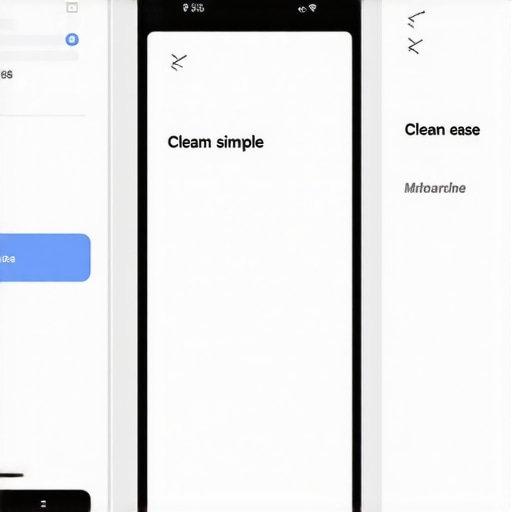
The Hidden Power of Simplicity in Mobile Web Design
In my early days of managing a website, I believed that a flashy, feature-rich mobile experience would impress visitors and boost engagement. But the truth was, my over-engineered site was slowing down and confusing users. According to Google, 53% of mobile site visits are abandoned if pages take longer than three seconds to load (source). This was a wake-up call. I realized that less is often more, especially on fast-paced mobile environments. Simplifying my site improved load times, reduced bounce rates, and made my content accessible on any device. Today, I’ll show you how to cut through the noise and create a mobile site that truly works.
Is Cutting Down on Features Really Worth It?
Initially, I was skeptical. Would removing certain elements hurt my site’s effectiveness? Turns out, the opposite is true. Simplified sites focus on the core message, improve user experience, and often outperform cluttered ones in search rankings. I’ve made plenty of blunders early on, like neglecting to optimize images or ignoring mobile navigation issues. These mistakes taught me that stripping away unnecessary elements isn’t about sacrificing quality; it’s about serving your visitors better. If you’re feeling overwhelmed by the complexity of your mobile site, know that this is a common hurdle—and one that you can overcome by making intentional, strategic reductions.
Now, let’s dive into practical ways to know what to simplify and how to implement these changes for maximum impact. Want to see how a minimalistic approach can revolutionize your mobile experience? Keep reading to discover steps that will make your site faster, clearer, and more effective.
,
Prioritize Mobile Speed Through Image Optimization
Start by auditing your images. Large, uncompressed images are the biggest culprits in slow-loading pages. I once used a tool like TinyPNG to optimize my largest images, which reduced load times by nearly 50%. Resize images to fit your content precisely, avoiding unnecessary bandwidth consumption. Implement modern formats like WebP for smaller sizes with high quality. For detailed strategies, check out this guide. Remember, faster sites keep visitors engaged and improve rankings.
Streamline Navigation and Reduce Clutter
Cluttered menus confuse users and increase bounce rates. Simplify your navigation menu by limiting options to essential pages. I once redesigned my menu by removing three irrelevant links, which made the user journey more intuitive. Use clear labels and a single call-to-action button on each page. Consider implementing collapsible menus for mobile devices to save space. The goal is to make it effortless for visitors to find what they need without scrolling through endless options.
Leverage White Space and Clear Layouts
Effective use of white space prevents overwhelming your visitors. During a site revamp, I increased padding around text blocks, which dramatically enhanced readability. Avoid stuffing your page with too many elements; instead, focus on a clean hierarchy. Use larger headings and concise paragraphs to guide users naturally down the page. Think of your mobile site as a busy highway—leave room for vehicles (content) to flow smoothly without congestion.
Optimize Content for Mobile Readability
Ensure fonts are legible, with a minimum size of 16px. I once overlooked this and received complaints about difficult reading. Use a font style that’s easy on the eyes, avoiding decorative fonts that get distorted on small screens. Break up long paragraphs with bullets or numbered lists to facilitate scanning. Additionally, keep button sizes at least 48px tall to meet user expectations and avoid accidental clicks. Check your site’s mobile usability regularly with tools like Google’s Mobile-Friendly Test to identify issues early.
Simplify Forms and Calls to Action
Forms are often a bottleneck for conversions. My initial forms had ten fields, which discouraged submissions. I reduced it to five essential questions, resulting in a 30% uplift in completions. Use auto-fill and type-specific keyboards to speed up input. Position your call-to-action buttons prominently and make them stand out with contrasting colors, but avoid overdoing it—remember, less is more. Test different variations to find what resonates best with your audience.
Implement Strategic Lazy Loading
Lazy loading defers loading images and videos until they enter the viewport. I implemented this on my image gallery, which improved initial page load time from 4 seconds to under 2 seconds. Use JavaScript libraries like Lozad.js or native HTML attributes to achieve this easily. This technique is particularly effective for pages with rich media, ensuring users aren’t waiting unnecessarily for content they haven’t scrolled to yet.
Use Code and Plugin Optimization Tactics
Minify CSS, JavaScript, and HTML files to reduce size. I utilized tools like Webpack and included only the scripts necessary for each page. Remove redundant plugins—each added plugin might slow down your site. Defer non-essential scripts and CSS to load asynchronously. These actions can be complex but are worth the effort—your site’s technical foundation directly impacts user experience and SEO rankings. For a step-by-step approach, see this resource.
Test and Iterate Using User Feedback
Regular testing on multiple devices uncovers unseen issues. I used beta testers to navigate my site and provided feedback on usability. Analyze metrics such as bounce rate and average session duration; improvements here indicate better user engagement. Conduct surveys or heatmaps to observe where users get stuck or lose interest. Continuous iteration based on real user data is the key to maintaining a fast, simple, and effective mobile site.
Many professionals assume they understand branding and SEO deeply, but a closer look reveals nuanced pitfalls that trip up even seasoned marketers. Contrarily to popular belief, branding isn’t just a logo or a catchy slogan; it’s about crafting a consistent narrative that resonates across all channels, which many overlook. For instance, some think that a strong visual identity alone guarantees recognition, but without aligning your messaging strategy, your efforts can become diluted. To master branding, explore comprehensive strategies outlined here.
Similarly, in technical SEO, many assume that optimizing for search engines entails solely keyword stuffing or with minimal technical adjustments. However, advanced SEO requires a holistic approach: ensuring crawlability, site speed, schema markup, and proper indexing are all harmonized. Forgetting these nuances often results in wasted effort or, worse, penalties. A common trap is neglecting site speed, which can drastically reduce your rankings—Google’s guide offers in-depth insights.
When it comes to Pay-Per-Click advertising, a prevalent myth is that increasing bids always guarantees better placement. Reality? Without meticulous keyword research, negative keyword management, and optimized ad copy, higher bids lead to wasted budget rather than conversions. Many overlook the importance of ad relevance and landing page quality, which Google considers crucial for effective Quality Score improvement. Delve into these tactics to prevent costly mistakes.
In web design, the misconception that aesthetics always trump usability is a significant pitfall. Beautiful sites that ignore user experience can suffer high bounce rates. Advanced designers understand that minimalism, white space, and clarity foster engagement—beyond just visual appeal. An often-ignored aspect is accessibility; ensuring your site is usable for people with disabilities can also enhance SEO and expand your audience. For more on creating user-centric designs, see this resource.
A key question arises for the seasoned marketer: How do technical details and strategic branding influence each other on a deeper level? The answer lies in the integration of data-driven insights with creative consistency. For example, aligning your PPC campaigns with your core brand message enhances both visibility and trust—think of it as reinforcing your identity through every touchpoint. This synergy is often overlooked but can significantly amplify results.
Be cautious of the trap of superficial tactics. For example, over-optimizing keywords can lead to search engine penalties, as does neglecting mobile usability. The biggest mistake is assuming that quick fixes or surface-level measures are enough; mastery requires understanding the underlying principles and avoiding shortcuts. For advanced strategies that steer clear of these pitfalls, consult this expert guide.
Have you ever fallen into this trap? Let me know in the comments.Maintaining a website’s performance over time requires a combination of robust tools and disciplined routines. One of my top choices is Cloudflare, which I use not only for CDN services to optimize load times globally but also for its DNS management and security features. Regularly monitoring your site’s uptime and response times with Pingdom helps catch issues before they impact visitors, ensuring a seamless experience. For analyzing traffic patterns and user behavior, Google Analytics remains indispensable; its insights guide optimization efforts and content strategy. Additionally, Screaming Frog SEO Spider is my go-to for technical audits, helping identify crawl errors, broken links, and duplicate content that can silently degrade your SEO health. I recommend setting up scheduled audits—weekly or bi-weekly—to keep tabs on these parameters proactively. For long-term results, maintaining an authoritative sitemap and regularly updating your robots.txt file ensures search engines can efficiently crawl your content without unnecessary delays. Implementing version control through GitHub or similar tools also streamlines updates, rollback capabilities, and team collaboration, especially when scaling your site or deploying new features. Moving forward, AI-powered tools like Surfer SEO are predicted to become more integral, helping automate content optimization based on evolving algorithms. As a proactive step, try configuring your CDN to enable HTTP/2 and enable caching policies that suit your content update frequency—small adjustments that deliver noticeable improvements. Remember, consistent maintenance extends your website’s lifespan, preserves your brand credibility, and supports ongoing marketing efforts. To delve deeper into technical SEO best practices, review this comprehensive guide. Stay disciplined, set reminders for regular audits, and leverage these tools—your future self will thank you for it.
Three Lessons I Wish I Learned Sooner About Branding and SEO
- Patience beats shortcuts: Early on, I believed quick fixes would boost my rankings, but I realized sustainable success requires consistent effort and strategic thinking rather than chasing instant results.
- Brand consistency is everything: I once thought a dazzling logo was enough, only to discover that aligning messaging and voice across channels creates genuine trust and recognition among users.
- Technical health impacts perception: Neglecting site speed and crawlability hurt my SEO more than I expected, teaching me that behind-the-scenes optimization quietly influences user experience and rankings.
- Conversion tuning is ongoing: Even after launching a great site, continuous tests and adjustments are crucial to identify what truly resonates with mobile visitors and to stay ahead of evolving expectations.
My Go-To Tools for Streamlined Web and SEO Success
- Google Search Console: An essential for monitoring indexing issues and site health; it keeps me aware of SEO performance at all times.
- Cloudflare: Its CDN and security features ensure fast, reliable loading worldwide—crucial for mobile users.
- Screaming Frog SEO Spider: I use it for in-depth audits, catching technical flaws before they become big problems.
- Surfer SEO: This AI-powered content optimizer helps me craft on-page elements that appeal both to search engines and humans.
Your Next Move: Embrace Simplicity and Experiment
Taking your mobile web experience to the next level isn’t about fancy features—it’s about strategic decluttering and ongoing refinement. Trust that small, intentional changes can unlock big improvements. Remember, every visitor’s click is an opportunity to serve a clearer, faster, and more engaging experience. So start today, test relentlessly, and watch your mobile engagement soar. What’s one small tweak you’re planning to try first? Let’s discuss below.