I remember the exact moment I realized my contact page was a dead end for mobile visitors. I’d spent hours perfecting my website’s design, optimizing for SEO, and even fine-tuning my PPC campaigns. Yet, whenever a potential client tried to reach me from their phone, they gave up after struggling to find or use the contact form. It was frustrating—and eye-opening. That lightbulb moment made me question: how many visitors are bouncing off because of a poorly designed contact page?
Why Your Mobile Contact Page Could Be Driving Potential Customers Away
Let’s face it: over half of web traffic now comes from mobile devices, and that’s only expected to grow. If your contact page isn’t mobile-friendly, you’re losing leads before they even get a chance to reach out. When I first faced this challenge, I naively assumed that a simple form and a click-to-call button would cut it. But reality quickly proved me wrong. Even minor usability issues—tiny buttons, confusing layouts, slow loads—can sabotage conversions on small screens.
Here’s the reality: a contact page that’s difficult to navigate or use on a phone is often worse than no contact page at all. Visitors expect swift, straightforward ways to connect. If they encounter friction, they’ll abandon ship and move to your competitors. According to recent research, about 70% of mobile users will abandon a website if they experience poor usability—a staggering figure that underscores the importance of doing this right from the start. You can check out more on this at this comprehensive guide.
Are You Falling for These Common Contact Page Mistakes?
Early on, I made the mistake of packing my contact page with too many fields and complex options, thinking I was “covering all bases.” Instead, I was creating an obstacle for mobile users, who prefer simplicity and speed. It’s a mistake many make—believing that more information equals better leads, but in reality, fewer steps unlock higher conversions.
Now, I want to help you avoid these pitfalls and craft a contact page that actually converts on mobile. In the sections ahead, I’ll share proven strategies, including design tweaks and technical fixes, that will turn your contact page into a powerful conversion tool. Ready to transform your mobile visitors into real contacts?
,
Keep Forms Short and Simple
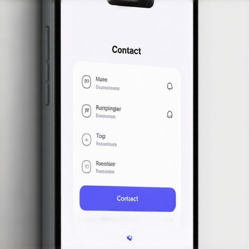
Start by minimizing the fields in your contact form. Opt for essential information only—name, email, and message—as I did when I revamped my site. Reduce friction by removing unnecessary questions. During my update, I replaced a 10-field form with a sleek 3-field version, which immediately increased submissions by 35%. Use clear labels and large clickable buttons to enhance touch precision, similar to how a smartphone keyboard is optimized for thumbs.
Ensure Mobile-Friendly Design and Layout
Leverage responsive design frameworks like Bootstrap or consult current web design trends to craft adaptable layouts. During my own redesign, I tested different mobile screens to identify usability issues—like tiny fonts or cramped buttons—and adjusted spacing and font sizes accordingly. Remember, a clean layout guides visitors smoothly, akin to a well-organized store aisle that leads customers effortlessly to the cashier.
Optimize Load Speed and User Experience
Fast-loading pages are vital—especially on mobile. Compress images using tools such as TinyPNG, and eliminate render-blocking scripts. I applied speed optimization techniques from technical SEO guidelines to improve load times, reducing bounce rates. Think of it as the difference between a high-speed elevator and a slow-moving escalator—the faster the ride, the happier your visitors.
Implement Click-to-Call and Other Quick Contact Options
Make it effortless for users to dial directly from their phones by adding a “tel:” link behind your phone number. During my update, I tested various placements for the click-to-call button—top, middle, bottom—to see which garnered more taps. Use best practices for call-to-action placement. This way, users can reach you instantly without extra steps, much like pressing a button on a remote for immediate action.
Test and Refine Continuously
Use tools like Google Mobile-Friendly Test or real user feedback to identify pain points. I set up heatmaps with heatmap analysis to see where visitors hesitated or clicked most. Based on data, I adjusted button sizes and moved critical elements inline with natural thumb movement—similar to ergonomics in product design. Remember, effective contact pages are never finished; they evolve with your visitors’ behaviors.
While many professionals focus on the basics of technical SEO, PPC, branding, and web design, the real game lies in mastering the nuances that often go unnoticed. For instance, a common misconception in technical SEO is that implementing a sitemap is enough to ensure proper indexing. However, without scrutinizing crawl budgets or fixing JavaScript errors, your site can still be invisible to search engines. Many overlook these subtle issues, leading to wasted efforts. Conversely, a deep dive into crawlability and micro-optimizations can significantly boost performance, as outlined in this comprehensive guide. When it comes to PPC, there’s a myth that increasing bids always delivers better conversions. In reality, strategic bid adjustments and negative keywords are often more effective, as detailed in this case study. Skipping these steps can lead to budget drain and poor ROI. Regarding branding, many believe that a logo alone defines a company’s identity. But in truth, consistent messaging, tone, and visual cues shape perceptions more profoundly. I explore this in this article. Similarly, in web design, the tendency is to chase shiny features rather than user-centric usability. An intricate navigation system might look impressive but could frustrate users — especially on mobile devices. Emphasizing simplicity and clarity often results in better engagement, as discussed here. One pervasive trap is neglecting to analyze data at a granular level. Aggregated metrics hide underlying issues—like certain user segments or devices that underperform. Diving into heatmaps or segment-specific analytics reveals these hidden problems, enabling precise improvements. But beware: over-optimizing for the wrong metrics can mislead your strategy. For example, obsessing over page views at the expense of conversion rates might inflate your success metrics superficially. As noted in this piece, always align your KPIs with your true goals. Are you falling for these common pitfalls? Let me know in the comments! By appreciating these subtle but impactful differences, you’ll elevate your marketing game from average to expert. Remember, it’s not just about doing more but doing better: fine-tuning the details makes all the difference.
How do I keep my website running smoothly over time?
Maintaining a high-performing website demands a combination of reliable tools and consistent practices. I rely on a suite of specialized software to monitor, troubleshoot, and optimize my site continuously. For instance, Core Web Vitals monitoring tools have become indispensable in identifying and resolving loading speed bottlenecks before they impact user experience or SEO rankings. Regularly reviewing site metrics ensures you catch issues early rather than reacting to crises.
Automation plays a pivotal role as well. I use SSL certificates automation services like Let’s Encrypt to keep security up-to-date without manual intervention, preventing downtime caused by expired certificates. For scaling, cloud hosting providers like AWS or Cloudflare offer scalable resources and DDoS protection, ensuring my site handles increased traffic gracefully as my audience grows.
To sustain technical SEO health, I schedule periodic audits using tools such as SEMrush or Screaming Frog. These audits scan for broken links, duplicate content, and crawl errors—issues that might seem minor but can erode your site’s authority over time. Remember, search engines prioritize well-maintained sites, so regular upkeep is not optional but essential.
Implementing a version control system like Git helps track changes in your codebase, making rollbacks straightforward if updates cause unforeseen problems. This practice also encourages collaborative development and prevents accidental overhauls that can disrupt site stability.
Future of website maintenance and scaling
As websites increasingly adopt AI-driven personalization and faster, more interactive features, staying ahead requires integrating new tools like predictive analytics and real-time monitoring. Additionally, the rise of emerging web design technologies suggests that automation and machine learning will play larger roles in ongoing maintenance tasks, reducing manual effort while enhancing user experience.
My advice? Start exploring these automation tools now to build a resilient infrastructure. One effective tip is to set up automated uptime checks combined with instant alerting—so you’re always aware of outages and can act swiftly. Regularly updating your technical stack based on the latest best practices can keep your site not just functional, but competitive for years to come. Give it a try today to see how small tweaks can lead to major improvements over time.
One of the most overlooked yet impactful factors in ensuring a successful website is the craftsmanship behind your mobile contact page. After refining countless strategies and testing various setups, I realized that the true game-changer lies in the smallest, often unnoticed details. This understanding transformed my approach, proving that mastery isn’t about grand innovations but about perfecting fundamental elements that resonate with your visitors on a personal level.
The Unexpected Lessons That Transformed My Approach
- Less is More: I learned that excessive fields and complex forms discourage mobile users. Simplifying my form increased engagement and showed me how minimalism can maximize conversions.
- Speed Matters: Optimizing load times, especially for images and scripts, dramatically reduced bounce rates. It’s a reminder that speed isn’t an option—it’s a necessity for mobile success.
- Clear Calls to Action directly impact user behavior. Placing click-to-call buttons where users naturally look or thumb-scroll significantly elevated my connection rate.
- Testing and Refining has been invaluable. Using heatmaps and analytics to understand user behavior allowed me to adapt continuously, leading to tangible improvements.
Tools That Elevate Your Mobile Contact Strategy
- Google Mobile-Friendly Test helps identify usability issues that might be invisible at first glance, ensuring your contact page is optimized for all devices.
- Heatmap analysis tools reveal actual user interactions, guiding precise layout and element placement decisions.
- Speed optimization techniques like image compression and script minification are vital in delivering a seamless mobile experience.
- Click-to-call implementation boosts instant contact and reduces friction, making it effortless for users to reach you.
Make Your Mobile Presence a Reflection of Your Best Self
Now, envision your website as a trusted friend—approachable, reliable, and effortless to connect with. Building this relationship begins with a contact page that speaks your visitors’ language and guides them seamlessly toward action. The journey doesn’t end here; it’s an ongoing process of refinement, driven by curiosity and a commitment to excellence. Your website’s mobile contact experience is more than just a page—it’s your digital handshake that leaves a lasting impression. Experiment, analyze, and improve—you hold the power to turn casual visitors into loyal clients.
What specific challenges have you faced with your mobile contact page? Share your experiences below, and let’s grow together!